Are you looking for fresh web design ideas and concepts for 2014? The industry is flooded with multiple new design concepts and trends going into the new year. However, you should know which trends to avoid and know the ones that can deliver better web design results. In this fast changing world, it is vital that web designers flush out the outdated ideas and adopt their style to the new trends. The following are the top 10 worst concepts that you should discard by all means.
Multiple web pages
Websites with multiple pages that are packed with huge amounts of content are becoming obsolete. If you design your site you must first consider the objective of each and every page and check if it is absolutely necessary to create a particular page. Each page should be justified. You know you have done a great job when you find the content in the site to be optimum – meaning, you find that there is nothing you need to remove, or add, to effectively get your message across.
Unrealistic stock photographs
Does your site use generic images? The best designs and concepts avoid using generic stock images that do not represent or promote an organization’s staff or brand identity. You have to be bold and make use of current pictures of yourself and the people that are a part of your team. These people may not be picture perfect but your visitors will trust you more. By projecting real life pictures you can build trust and popularize your brand name and add an edge over your competitors who use fake avatars and model photos to represent themselves and their brand.
Ribbons:
These decorative designs have been popular in the industry for quite a few years. But how long should you follow this kind of designing trend? The time is ripe to discard this trend and adopt new concepts.
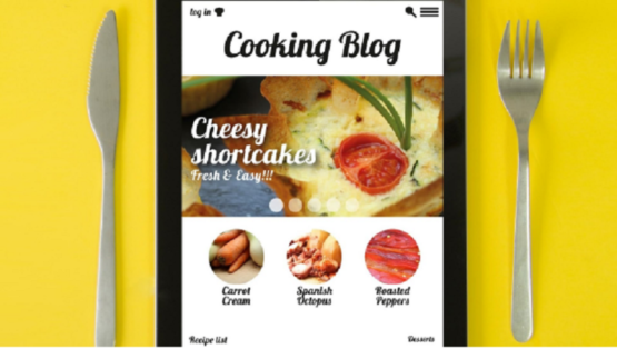
Indefinite content hierarchy:
Do you wish to incorporate style tiles in your website design? If so, first make sure that your website is ideal for this style of web design. Style titles offer a perfect forum for initiating discussion as well as clarifying the goals of a business and likewise projecting your personal preferences. Not all content will work well with tiles as it would with columns. Your objective is to display the content of your website logically so that the message of your website is clear to each visitor.
Multiple share buttons
Too much of anything is typically bad for you. Same is true for too many share buttons! Your site may include share buttons so that content can spread virally. But if you use such buttons excessively it may not be good for your site. You may unnecessarily confuse the visitors or clutter the site with multiple icons that conflict with the overall design of your site. Make sure that you select the most vital networks and use their buttons respectively.
Design the websites like newspapers
Lengthy text, tiny letters and serif fonts are perfect for print media such as magazines, newspapers and tabloids. Web content writing is a different ballgame altogether. Use short texts and readable fonts for a better experience for the visitor. This also helps them to easily learn more about you and your services in a clear, concise way.
Incorporating too much of boastful text
Many people love to talk and boast about themselves and their personal achievements on their website. Instead, talk more about the value of your company and its services to promote your site and attract potential customers. The same rule is applicable when designing your website. Avoid using boastful text that serves no real purpose. Create an ‘About Us’ page that places more focus on your company, your niche, or service than one that is all about yourself. Use honest and detailed information and impress your customers as a trustworthy business.
Unclear color contrast
Make sure that the visitors of your website can read the text as well as view your images easily. If you select conflicting color contrasts you only create a bad experience for your visitors. For example, a light green background with slightly light green text is a poor contrast choice and can create a negative response in the viewers’ mind. Use the right color contrast and make your content more prominent in the web world.
Use of icon menus excessively
Icons can be entertaining and funny. They can also make web design quite challenging. With so many choices and styles of icons that are available, choosing the appropriate icons within your website can prove to be difficult. Use special icons to compliment the call to action versus using icons that conflict or are not representative of the function being used for.
Make use of flash banner for advertisement to About Us web page:
You should not confuse visitors with unnecessary animations and slides. Use this to be informative as well as colorful. In this way, people will want to know more about your partners and will be more compelled to click an advertisement banner to learn more details. The more obvious your advertisement banners are, the more people will be grateful for them.
Know about the web design ideas that you avoid and make your website more appealing to the viewers.