You must ensure proper typography to meet the requirement of your audience. Effective and attractive typography is the key component to successful website design. This is especially true for mobile, where the margin for error is as small as the screens used for viewing these websites.
If your chosen font works perfectly for the desktop version, can you safely assume that it will be perfect for mobiles as well? Most styles and practices that are perfect for bigger screens tend to break down causing trouble for the smaller mobile screens. To deliver best possible experience to the mobile visitors, we need to consider mobile typography of websites. This will ensure an attractive design that is easy to use as well as enjoyable to go through regardless of the type of device used to visit the website.
Typography is one of the most significant concerns when it comes to making a website responsive. We need to understand how people read on the mobile devices as this will help to adhere to the best practices pertaining to mobile typography.
Here are a few ways to choose the right font for small screens.
- Observe the Way Audiences Read on Mobile
To choose the right fonts, you must observe the way, people read on mobile. Do this by visiting different places where you can observe people using laptop and mobile devices. You must focus on the readability quotient. If users can go through the text, your design is working perfectly. If not, it’s time to make the fonts readable.
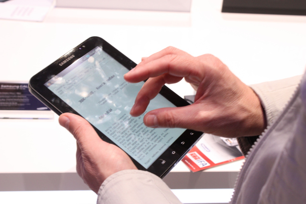
- Lights and Visibility
This is the next aspect that must be brought under consideration. When a touch screen device is used, the finger does the job of navigating. This blocks a part of the screen automatically; this is different when compared with the desktop devices.
Responsive Web Typography Basics
Website typography need not be a ‘one size fits all’, thanks to responsive web design practices. With the aid of a responsive website, the CSS media queries are possible to use for changing visual styles of webpage based on the screen size of the visitor. Thus, you can set a website for using one set of typographic styles for the bigger screens. Now adjust these styles, making it fit for the small screen sizes.
Unlike typefaces designed for desktop or print, responsive and mobile typography is not measured through a point system. On the contrary, it is designed using pixels.
Remember that your goal is not to maintain consistency but to design a positive reading experience, regardless of the screen size.
While developing responsive web typography, the key areas that ensure readability include:
- Load time
- CSS styles
- Typeface
Preferred Mobile Typeface
The fonts used in a given design play a significant role in determining how readable it will be on the mobile devices. The letterforms that are too intricate or thin are not just hard to go through, but it tends to break down at smaller sizes too. Thus, when the fonts get scaled, readability challenges arise. This is especially true for devices that do not have Retina screens.
To get rid of this problem, most designers today opt for the sans-serif fonts. These simple and straightforward letterforms tend to scale better making way for a readable presentation across a range of resolutions and screen sizes.
Should you Use Different Fonts for Different Screens?
While deciding on the fonts to be used on your website, find out if you want to use the same fonts across various screen sizes or if you want to change the font for different screens.
If you want to use the same fonts, you need to go for ones that are possible to scale both small and big. If willing to adjust the font choices as necessary, you can go for the serifs or the more involved fonts for larger displays. Next, you can change them to simpler fonts. Make sure to test the choice with real users.
Typographic Styles
With just a few lines of CSS, you can change the look of the site content, including the line height, size, line length, etc. These styles play a dominant role in the readability of the website and are critical for mobile screens.
Let’s have a look at some of the most significant considerations while choosing right mobile typeface.
- Size
There isn’t any default font size that is to be used for mobile screens. However, anything that is smaller than 16 pixels is not just hard to go through but it also adds confusion as to where the beginning and the end of the text is.
On the other hand, too large texts may create awkward breaks.
- Space
Space is vital when it comes to small screens. Extra space around and between text is critical given the struggle with lights or screen obscurement caused by cases or fingers.
As the mobile screens are quite small, it is hard to read the lines of the text set together closely. The line heights that are set for the desktop version is quite challenging for mobiles. You can start in the range of 10 to 20%, but this is quite dynamic since different fonts need different settings. Line height of 1.5 is one of the best places to start since it offers the readers a perception of airy but readable text.
- Layout
Not just space and size, but the layout also can cast a huge impact on the overall reading experience of mobile. Text with small line lengths disrupts the normal flow of reading.
The principals of good typography that applies to varying design mediums are also applicable for mobile typography. Typefaces that are easy to go through with clear letterforms and proper spacing is a must. With the mobile websites, make sure to consider the unique characteristics of the devices in concern, the way people interact with them as well as diverse environment in which they are used. Always remember that designs are not for the designers but the users. As soon as you have decided on typography, test them to find out whether it can cater to your targeted market.
Image Courtesy: blogthinkbig.com