When conceptualizing your mobile app’s user interface, there are a few things that you should keep in mind. Some of the basic things such as clarity of interface, consistency from one view to the next, and making sure that tapping on any button or UI element provides feedback to the user are fairly straightforward and are generally, though not universally, followed by most app designers.
Designing the interface of a mobile app is both challenging and entertaining. But beyond that, it’s essentially important; even the hardware giant like Apple explains its importance by providing developers with a list of Do’s and Don’ts. The work becomes easy if the UX designer keeps in mind few important things such as the clarity of the interface, consistency between two different views and a smooth interaction between the UI elements and the users.
But though essential, these are not the only requirements. There are other equally important issues to take care of. In this article, we’ll discuss some of them;
Users are too varied
App designers often make the mistake of thinking all app users belong to a homogeneous set. Nothing can be further from the truth; different users have different intentions and expertise. A user, who is a sheer beginner, is likely to make too many touch errors and handle the app slowly. Besides, since they are not sure about how each button functions, they often tap reluctantly.
App designers need to understand the discrimination that exists between the app users. Understanding this difference could help them work on fascinating apps with rich user experience. But it’s not possible to implement this difference at the time of designing the app because it can never have two different versions for two different sets of users. But to ease the users, the designer can make the app experience as user-friendly as he could and make sure it encompasses both sets.
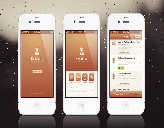
The location of the UI
The placement of the UI elements is of paramount importance. The UI elements are placed either at the bottom or at the top of the screen and their location does play a crucial role in the context of user-experience.
Most users are right-handed and they use their right thumbs to touch the screen. Reaching the top of the screen is not only less easy, but also counter-intuitive for the normal functionality of the application.
UX designers are recommended to keep the primary buttons to handle the app at the bottom of the screen. The buttons for secondary application should be at the top. This arrangement ensures the thumb of a user reaches the bottom corner of the screen seamlessly.
Button size matters
The mobile interface offers no room to clicking. If you are a mobile users, then the tip of your finger is the substitute for a computer mouse. This simple and innocuous fact makes button size crucial. The size should be apt, not too big or too small so a user could tap on them with ease.
Experts believe the width of a button shouldn’t be below 1-centimeter because it’s difficult to tap a button with any width smaller than that. They also recommend non-uniform button sizes because it sends the message to the novice users that some buttons (the large ones) are more important than others (small ones).
Many of yesteryear’s best button size practices are still relevant. One of them is the rule that the button is should be proportional to the square root of the probability that it would be tapped by expert users.
High resolution images
The USP of the current generation Smartphones is they feature high-resolution images. The visual aspects of the interface depend heavily on whether it renders high-resolution images. So if you are an app designer, then converting the low-resolution images to high-resolution ones is a must for you.
Not all mobile interfaces are clocked at the optimal retina density (326ppi) mark. The ideal limit is 264 ppi that makes the interface look attractive. Image selection is the key process; the vector based images scale themselves automatically depending on the screen resolution, and that’s why the interface designers should pick them.
The four tips can help mobile app designers build an interface that is stable, fluid and user-friendly. If you are an app designer, then pay attention to the discussions done above and take cues. There’s nothing sweeter like being appreciated by the users, and the tips given above can help you achieve that.