Just like web designs, logo designs also tend to change. When new web design trends arrive, we simply choose to forget about the existing ones and focus our attention on the new ones. And this is itself a trending practice that happens every year.
Adapting to new trends is good for a brand’s growth. It helps a brand to stay consistent with the rapid technology change and shifts, giving customers a seamless experience all throughout. But then, following new trends does not mean that you forget all about your brand’s customer engagement. In other words – a good web design should be able to transcend the immediacy of the upcoming trends while still employing elements driven by the necessity of effective engagement.
Conventional Consistency is Therefore Important for Good UI
There are some things in the design world that are better when left alone. Just like the two vertical bar icon of the Pause Function. People have grown so familiar with it that replacing it with an octagon or a circle is bound to leave users confused.
It’s the Science of familiarity that matters the most in web design. It leads to comfort and happiness – the two things that are necessary for a business website to generate higher conversion.
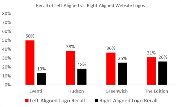
Similarly, logo designs are largely dominated by conventional consistency for maximum brand recall and therefore matters how it is placed on a website. According to Nielsen Norman Group report, 89 percent of users are likely to remember a website better if a logo is placed on the left side and not on the right. So yes, placement of your logo design matters a lot when it comes to maintaining parity between logo design and web design.
But what about unusual logo placement practices that promise unique brand engagement?
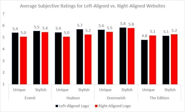
Apparently there is seems to be no statistical evidence to support this statement even though some designers might claim it so. Even if some websites are seen to break away from the conventional logo placement practice, records show no proof of any significant difference in website conversion. On the contrary, there were cases where left-aligned logos got slightly higher subjective rates in terms of uniqueness and stylishness.
This is an indication of a message that is clear – Good web design knows no short-cuts such as disregarding of standard web conventions.
An Understanding of Why People Prefer Familiarity
People tend to rely more on familiar design patterns that make sense and not confuse them. These are like the little pieces of breadcrumbs that help a visitor to identify things easily when they land on a web page. They can focus better on the task for which they have come to the website and that is why designs are loved only when the features are recognizable.
The risk of losing customer attention only happens when websites break away from these familiar conventions. This explains why people love simple designed websites more.
Other Conventional Factors to Consider When Designing an Effective Logo
A good and effective logo should be distinctive, practical, appropriate, simple in form, graphic and should be able to convey an intended message the right way.
There are five principles that work behind a good logo design. Make sure that when you design a logo for a website (whether it is yours or a client’s), the principle factors are not missed out.
- Simple
There are many elements that people tend to take notice of every day. However, they cannot remember everything. A simple logo design makes it easy to recognize and avoid any sort of confusion. This is the first principle factor that helps to maintain consistency in your business branding throughout. For instance, you come across a potential client and give him your business card (with a bright red logo printed on it) for future reference if needed. A few months later, the person suddenly feels the need of availing your service. They Google out your business name. The sight of that bright red logo makes them feel at once comfortable and they feel good having landed in the right place. The feeling of being at the right place is your first customer engagement factor down the conversion funnel.
- Memorable
Simple logo designs are easy to remember and hence are comparatively more memorable. Since simple designs are easy to recognize and remember, customers tend to trust them more. That’s because when they see a simple designed logo, it immediately gets registered in their memory. This builds up an instant connection, thus increasing a brand’s chances of establishing a trustworthy reputation and generating faster conversion.
- Timeless
Timeless logo designs are hard to forget. They continue to remain like forever marks and that is what an effective logo design should be. Logo designs need to be simple enough to be easily recognizable. However, let’s not make the term ‘simple’ overhyped. A logo should be able to exhibit qualities of unique design features. Take, for instance, the Evernote Logo that features an elephant’s head. There is nothing unique about it. However, it’s the curled trunk and the folded ears that make the logo easily recognizable.
- Versatile
For an effective logo design to be functional, it should be able to function across various functions and mediums. Whether it is on the mobile application or the website home page, logo designs must be consistent throughout. It should be able to work in any format, be it vertical or horizontal. That means you will have to take into consideration certain factors like –
- The subjective nature of a brand’s logo color
- The size of a logo
- Appropriate
This means that a logo design should be created for what it was intended for. This means implementation of the right fonts and color schemes. The conveying of an appropriate business message is what a typeface should be able to accomplish. That is why; choosing the right kind of typeface that possesses unique clarity, personality and legibility should be what your brand logo design should be about.
It is important to note that designing appropriate brand logos does not mean showing what a business is trying to sell. For example, the Harley Davidson logo is not about motorcycles. Construction of symmetric logo designs ensures that a logo is designed proportionally, using consistent arcs and curves.
The Conclusion
Good Logo Designs will spell good conversion. You may adapt to new logo design trends anytime to refresh your brand image outlook. Nevertheless, make sure that your logo design is able to maintain the consistency throughout a web design for maximum brand recall.
Image Courtesy: pixabay.com