
A simple design isn’t so simple to achieve.
The statement might look like a paradox, but it does hit the nail right on the head.
According to a study that’s made by Google in 2012, it’s been found that users rate “visually complex” websites to be less beautiful than their immediate counterparts.
We’ll explain this with a simple example. The classic Google homepage.
Why does the Google homepage look so simple?
The Google homepage is a classic example of how simple a website can be. It’s one that’s filled with whitespace all around. White signifies cleanliness, purity, and neutrality and hence, it goes almost perfectly with the design.
According to the founding fathers of Google, the simplicity of the Google homepage has occurred as a result of Sergey Brin’s limited knowledge of HTML. Additionally, they also claim that they didn’t have webmasters during that period of time and hence, the page had one of the simplest designs of the lot.
But do you think that’s it? If that was the reason behind all this, they could have easily gone ahead and re-modified it to something complex in later years. But did they do it?
They didn’t. They just made a few alterations to the logo and altered a few options here and there and kept the page almost identical to the way it was at the start.
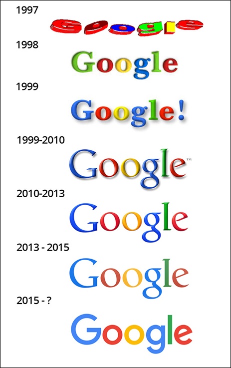
The evolution of Google logo
That’s because such a simplistic design helped them a lot in the long run. They started attracting traffic at a frightening pace and today, it has actually turned into a giant on the World Wide Web.
The Google homepage goes so easy on the eye. With plenty of whitespaces all around, even a primary school kid can understand everything on the page in the blink of an eye.
To sum up we would say that the Google homepage has:
- Easy looks,
- Plenty of whitespaces,
- Simplicity,
- Easier comprehensibility,
- Uniqueness and
- A whole LOT of traffic and business
Why would it want to change things for the bad?
So that takes care of Google then. Let’s go back to our main topic now.
Simplistic web design: Is it really a friend or a foe?
The Google case study that we have provided above proves the fact that simplistic web design is indeed your friend if you can do it the right way.
The simpler the design, the better it is. Why? Because of two major things:
- Cognitive fluency
- Human visual information processing ability.
So what are these? Let’s see.
- Cognitive fluency
Cognitive fluency refers to the experience of difficulty or ease of completing a particular mental task.
It has been found that people usually prefer things that can be easily comprehended in matter of seconds to things that are difficult to think of. Cognitive fluency works exactly on that underlying principle.
This is one of the main reasons due to which you prefer visiting websites that you know. This is also one of the main reasons due to which you prefer visiting sites that can be understood in a jiffy.
Have you ever heard of the Zajonc exposure theory?
It says “The more exposure we have to a stimulus, the more we will tend to like it. Familiarity breeds liking more than contempt.”
The same thing is at work here.
Simplicity can make you familiar to something in matter of a second. You also start developing a natural affinity to it after a certain period of time. So if you want to popularize your website among the masses, a simplistic approach is the way to go.
- Human visual information processing ability
If you look at this study (made in join collaboration between Harvard and Maryland University) closely, you will realize that the defining factor “aesthetically pleasing” varies between variable demographics. There was one constant factor though, and that was the connection between simplicity and aesthetics.
So we can easily conclude that a complex website has a lower visual appeal (in general) almost all round the globe. How about you take the test and find it out yourself? It’ll just cost you a few more minutes, not bucks.
Simplicity is also easier to process. This short video can explain this more than anything.
Let’s talk about whitespace
Whitespace is a very important factor in website designing.
It’s something that is adored by most designers almost all round the world. Website designers want it more. Website owners, on the other hand want to fill it more. So you can see that there’s always a clash of interest between the two as far as this integral aspect of designing is concerned.
But what exactly is whitespace? Let’s see…
Like the name suggests, whitespace refers to the empty space of a website. Often whitespaces are seen to be one that are unutilized and unproductive but is it really so?
If you are a website designer and think of whitespace as a waste of screen space, you are in a fool’s paradise. You need to get out of it as soon as possible. Whitespace is as important to a website’s success as the other elements. Why? Take a peek.
The different benefits of whitespace
- Whitespace gives your website content an improved legibility. This improves your website readability which is a big upside in itself.
- Whitespace can improve the engagement rate on your website.
- Whitespace can also improve your site’s comprehensibility, thereby driving in more traffic from relevant sources.
- Through the aid of whitespaces, you’ll be able to significantly highlight your CTA (Call to action) buttons.
- Whitespace can help to keep disorganization at bay.
- Whitespace also acts as a separator.
- Last but not the least, whitespace helps to create a tidy website. If this is not a benefit, we seriously don’t know what is.
Conclusion
To sum up, we would definitely say that a simple web design can be your friend in the long run provided you create a balance between your website whitespace and the site elements. What do you think?
Image Courtesy: pixabay.com