
You may design them circular or you may design them rectangular, but every size of a CTA button should be designed relative to its surrounding elements.
Designing a CTA Button for a Web Page
Call-to-Action buttons are the conversion pipes of websites and landing pages. Their function is to convince users to take a particular action that you want them to take. That is why, apart from the position in which they are placed, how they are designed also matters. CTA buttons should be designed to be easily noticeable to whoever is visiting a site or a web page. Or else, what’s the point of placing a Call to Action that does not clamor for your attention?
Here are three sample-tested CTA examples that have been experimented with and therefore serve as a good demonstration.
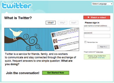
Here is a service page design that perhaps features the world’s tiniest CTA button. Can you spot it out?

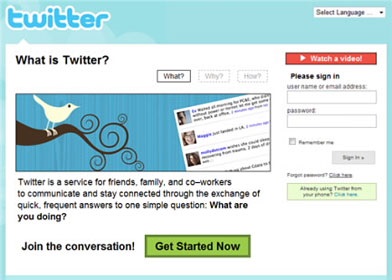
In the next sample page, the CTA buttons have been enlarged for better visibility. You may, however, notice that the ‘Continue Shopping’ is larger than the ‘Add to Cart’ button.

Many of you would prefer going with the third sample page. This is because, both the design of the CTA button is large, easy to read and well-positioned according to the basis of priority.

CTA Size Matters Just Like the Button Color Does
To emphasize a little bit more on the statement, let’s look into Fitt’s Law that brings a wonderful mathematical formulation that can be used in a number of ways, including human interaction with graphical user interface.
According to Fitt’s Law, the total time taken to acquire a target is determined by both the distance and the size. Human action takes a longer time to respond with smaller sizes and greater distances. The psychological journey to take the relief to action does not feel rapid. When we apply the Law on the principles of a CTA button design, this is what the implications turn out to be, which explains why size matters when designing elements of web interaction –
- Level of Precision
When interactive elements in a web design decrease in size, it leads to shrinking down of the surface area. As a result of which, the increase in the level of precision affects the selection time. Hence, an interactive element must be distinguished in shape and size compared to other interactive elements.
- Periphery of the Display
The human attention is programmed by nature to avoid any kind of sharp objects. That’s because sharp object represents a possible threat. A CTA button with sharp edges (in the case of a rectangular shape) requires a little bit of more visible cognitive effort compared to an ellipse of the same size. As a result of which, the process of action slows down. Rounded corners, on the other hand, are drawn inward and therefore, are easier to pull the attention towards the inside of the content. As the user finds oneself restricted in movement within the boundaries of the design, it directs the attention more towards the periphery of the display.
Determining the Size of Your CTA Button
Web design is an art, designed to magnetize potential customers. CTA buttons that are big in size are easily noticeable and therefore hold more importance than buttons of smaller size. But do all big sizes rock website conversions? Not always and yes it is contradictory to the above statement. That’s because there is no consistent formula when it comes to web design. As long as a design is seen to trigger interactions, it will work. However, the minute it stops inducing engagement or is surpassed by some other trend, a design loses its position of conversion. The same logic applies to a CTA button design on a web page.
Here is an example of one such big CTA button that had a negative impact on a service page –

The point is, CTA buttons should be big enough to be visible but not to be Hulk overloaded.
A good design should be capable of communicating priority to viewers. The other reason why CTA buttons should be big is because it’s meant to highlight the sense of urgency – ‘Take the action now’. The priority here is obvious.
On the other hand, a website can have multiple CTA buttons working on one page. The size and shape of a Call-to-Action button, therefore, should be used to indicate its relative importance in respect to other actions present within the vicinity.
Here is an example below showing how a CTA button has been used in this context.

Notice the difference in size between the two action buttons on the same page. The Sign-up button is made significantly bigger because the people behind the service page want visitors to subscribe rather than just read the blogs. This way, they will always be able to keep subscribers in the loop of their customer service.
Two buttons of the same size, when used on the same page, gets difficult convey the order of priority. It is the size that is required to balance the act of favor in terms of importance. Take a look at this another example. Which one do you think highlights more priority when it comes to asking a viewer to take an action?
There is another benefit that only the size of a CTA button can help a website in. People who are color blind might find it difficult to get influenced on the basis of what color you use for your CTA buttons. The size is what will direct them to take the desired Call-to-Action. Besides what color you choose to use for your CTA button can be determined by the size only. One of the best practices of color selection for CTA design is the use of less prominent colors for larger buttons and brighter colors for smaller buttons.
The Golden Rule for Every CTA Design Size – Always be Split Testing
No web design is complete without A/B split test. It helps you to decide upon the usability of your added unique value proposition.
Sometimes how you place your button also has a major role to play when it comes to measuring the usability of your CTA button size. You can create multiple variations of your CTA button design, but never forget this simple golden rule for it will reap you results no matter which design you decide to work upon.
Image Courtesy: pixabay.com