Before approaching icon designing, there are a certain set of guidelines and principles worth studying.
If you, as a designer, want to create influential icon designs, you must take a holistic approach to issues like simplicity, size, lighting, audience, size, perspective, and style. This article can give you a good starting berth to create icons that work well together and fit effortlessly with your designs.
- Capture the object characteristics as seamlessly as possible
One of the fundamental aspects of icon designing is to create an icon that can be recognized in a jiffy. No matter whether it’s meant to portray a tin of pencils or a blue frog, what it’s trying to exhibit must be noticeable and understood at a glance, or the purpose of the icon is defeated.
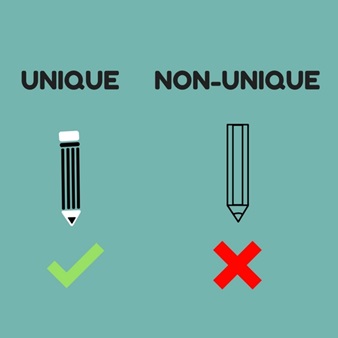
It is also better for the designer to choose the more detailed form of an object because there are only a handful number of items sharing those unique characteristics thereby, making it easy for your audience to identify the object you are trying to portray. Let’s refer to a simple example, say a pencil, for the sake of this explanation.
When you are trying to create an icon representing a pencil, you must realize that plenty of cylindrical objects are available out there with pointy tips besides pencils, including the likes of markers, pens, nails, etc. So, what makes a pencil unique?
Its prism-shaped body coupled with an eraser attached at the top. The below illustration can explain this wonderfully.
- Think from the perspective of an icon; not an image
An icon isn’t just a photo in a box.
Yes, it can include an image, but at the same time, it may also be a logo, text representation, or a combination of those elements.
The main point for you to remember is that your design should be highly visual and easily recognizable. Most icons representing a game or a software or a web element usually don’t include an actual photograph of the content. What they normally do is to present a graphical representation of the idea.
And then, an image may also become exceptionally difficult to comprehend at small sizes. It may also get lost in a sea of icons on a user’s desktop, phone, or any other device. Hence, a simple graphical representation of the content may often carry more visual weightage from the user’s point of view.
- Avoid using words in your design
One thing which you probably won’t see much in icons is the use of words. That’s because there simply isn’t enough room in an icon to include words that are easy to read and comprehend.
As a rule of thumb, I would advise you to avoid using text altogether in your design unless it is a part of the logo. Even the textual part of the logo (if any) should be carefully considered before utilizing the same in your designs.
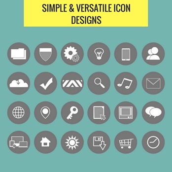
- Keep your designs simple and versatile so they fit into a range of other objects
One of the key values in an icon designing process is to keep them simple with a basic style, as opposed to going for a definitive designing style.
This helps to make them more versatile and useable in a whole range of projects sold as a complete package to the developers.
Remember, if your icons look at home in a wider range of settings, its potential market of sale becomes bigger. So you will always be at a benefit.
- Go for vibrant colors to make your icons a standout among the crowd
Want your icons to stand out? Then you must go bold with your color choices.
A vibrant color choice would help your icons stand out on a variety of backgrounds giving you the opportunity to capture attention at a moment’s glance. Here’s a case in point:

Source- Flickr
The last thing you would want your design to do is to blend in with the other available options. This makes sky-blue a color which you would likely want to avoid because most other icons use it.
In case blue is the primary logo of the brand you are trying to portray, try to pair the same with something brighter for impact such as lime green, bright orange, or simply yellow. You would soon produce something out-of-the-ordinary in no time.
- Design your icons in a vector format
Icons often have to be used in a range of different sizes. This gives you an excellent opportunity to make the most of scalable vector graphics (SVG) for creating exquisite designs suitable for multiple purposes. And there’s something more as well for you to cherish.
With vector software packages like Inkspace and Adobe Illustrator, every gradient, shape, and stroke making up the icon can be tweaked and altered at any point in time without any loss in quality, unlike a design relying heavily on pixels calling for redrawing when the changes are made. яндекс
So turn this statement into your personal thumb rule for your own designing benefits: “Always design icons in a SVG file format.”
- Think outside the box
The recent icon designing trends have seen a lot of samples using single color backgrounds exhibiting:
- white icons,
- long shadows, and
- flat designing techniques.
While these trends can definitely do the job to a certain extent, do not feel afraid to explore more. Think outside the box, and you may well reap the rewards.
For example,
If everyone else is working on square icon edges, consider going for something more rounded. Also, don’t hesitate to add a hint of texture to the background to stand out from the range of flat colors*. Who knows? It may well get the odds moving in your favor.
*Note: Flat colors have lately become the trend of modern web and icon designing.
A final word…
It may sound a bit cliché, but the key to a good icon design is simplicity, noticeable colors, and easy visual recognition.
And always take the UI and UX into consideration before doing your designs so your icon can fit seamlessly with the platform interface. After all, an icon is a user’s doorway to your digital interface.
Image Courtesy: Pixabay.com