
Most digital marketers harp on the importance of search engine optimization, social media marketing, creating lead magnets that actually covert, yet focusing on an excellent website design is so often ignored.
While these components do matter, but at the same time, you must realize that your website’s not meant to be just a pretty face. In fact, its design can actually make or break your conversion rates depending on the way it’s done.
According to a Stanford University research, 46.1% of people agree that the design (and the UX) of a website is the fundamental criteria for deciding whether the company is credible or not.
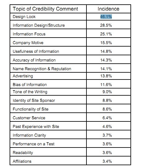
Image- Stanford University Report: Things affecting the credibility of a website on the World Wide Web (Source- How Do Users Evaluate the Credibility of Web Sites?)
Hence, it is extremely important for you to make your design look professional from the point of view of your audience. The following tips can help.
- Base your design on Hick’s Law
Named after William Edmund Hick, the famous British psychologist, this law says that the time taken for an individual to make a decision is directly proportional to the number of choices presented to him/her.
In simpler words, we can say that by increasing the number of choices, you can also increase the decision-making time of your audience; something that’s undeniably undesirable from the point of view of web-designing.
Why? Here’s why.
You may have heard about the famous psychological study made by the psychologists Mark Lepper and Sheena Iyengar where they found that a table displaying twenty-four types of jam invited less interest from the crowd than a table displaying only six.
That study is a clear example of Hick’s Law which showed that action is lost in proportion to the number of options being presented.
Therefore, you should limit the number of choices for your audience to boost your conversion rate as far as professional web designing is concerned. For example,
A plain and simple full-screen welcome mat can work wonders!

Image- Screenshot of a full-screen welcome mat
- Apply the popular photography principle- The Rule of Thirds
The Rule of Thirds is an important photography principle that you can apply to your web designs to get an improved result, on the whole.
According to this rule, you should visually divide a photograph (which in your case is a webpage) into thirds (both vertically and horizontally) to give yourself nine equal squares.

Image: A photograph broken into 9 equal squares on the basis of the Rule of Thirds (Source- Wiki)
The Rule of Thirds then say that the four intersection points of the grid are the strategic places of interest (refer to the image below). When you place important objects at these intersection points, it creates the most visually impactful design or image.
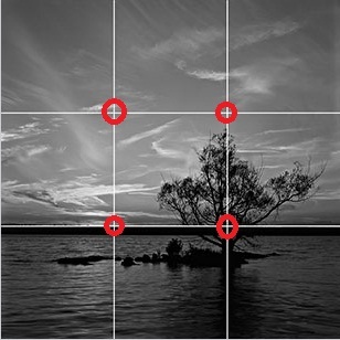
Image: Four intersection points of the grid are marked with red circles for depicting the strategic places of interest
In terms of web designing, you can easily place all your page’s crucial elements at these intersection points to get them viewed at a moment’s notice. Your conversion rate will also increase significantly at one, and the same time.
- Show your respect to people’s impatience
It’s a fact that people are incredibly impatient when it comes to browsing the internet. Respect that.
According to a study made by the Aberdeen Group, it’s found that a simple one second delay in the page loading time results in a 7% decrease in the conversion rate.
Thus, as far as the page loading speed is concerned, every mini, micro and nanosecond counts. It’s, therefore, advisable to go for the fix on priority in case you face issue with your page loading speed.
Note: To check your webpage speed on desktop and mobile devices, run your website through the following free tools:
- Pingdom
- GTmetrix
- Google PageSpeed Insights
- KeyCDN
- Sucuri
- Use your whitespace wisely
If your audience has to play hide and seek on your website to find your call-to-action button, they will definitely not be amused.
Now, imagine yourself visiting a movie website to get yourself two tickets for the upcoming blockbuster and not being able to locate the “Book now” button. Frustrating; isn’t it? Your audience also feels the same way when they aren’t able to locate your call-to-action buttons on your website.
Solution- Place your call to action or conversion forms on whitespaces to make it easy for your audience to figure them out. Here’s a fine example:
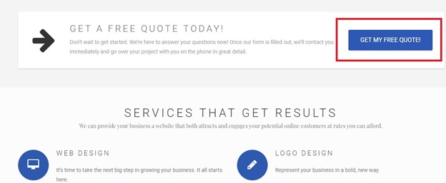
Source- Palmetto Web Design
Note: While whitespace is undoubtedly an important element of your design, you must also remember at the same time that too much whitespace between your actionable area and the supporting content can create a sense of disconnect for your audience.
This can make your audience see your call-to-action buttons as a separate element than the continuation of the text. So do not overdo it. Use this principle tactically to get great results in the long run.
- Establish a powerful visual hierarchy
Powerful visual hierarchy acts as a guide to the visitors’ thought patterns, making them naturally flow through the information.
In simpler words, we can say dominant visual hierarchy is more about designing a wonderful layout to set the expectations of the visitors for maximum conversions.
It’s like telling a story where you communicate to your audience through your design. If you can do that, you will see your conversion rates improving for sure.
Note: For more information on visual hierarchy, refer to this wonderful article.
Additional tips
- Use a large and benefit-driven headline at the top which is brief and right to the point.
- Use eye-catching visuals that convey the important point of your page drawing your audience’s eyes towards the main call to action button.
- Make your signup buttons simple, large, and clear.
- Deploy power words to make your matter more attractive and more engaging.
- Use multimedia tactically such as audio, video, or any other interactive content.
- Deploy hover effects on buttons to make them change colors on mouse-over. That will make them more satisfying to click.
- And finally, utilize animated exit-popups to re-engage audience losing interest in your website.
So that brings us to the end of this article. Hope you had a good and enlightening read.
Image Courtesy: Pixabay.com
