Your design lives in a finite screen. There is so much to say, do, and offer within a tiny box that every pixel here is a valuable real estate. Even the amateur designers know that they should not overload a single page, but as soon as you ask how much white space you should include, even the seasoned designers draw a blank.
Negative space or white space refers to the screen space that lies between existing elements. It need not always be white or blank if you are using a colored, textured or a patterned background. Effective usage of space in interaction design needs an understanding of functionality, aesthetics, and human behavior. Spatial design is actually the link between stylistic dimensions of visuals and language and the practical ones of time, responsiveness, and user behavior. Space exists in between, dealing with concerns on both sides of the spectrum.
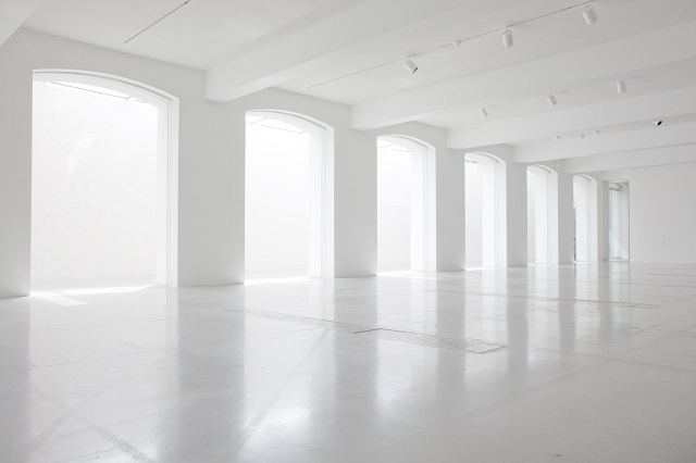
Don’t be Frightened of Blank Space
White space can be quite daunting. It feels like an empty canvas that you must replace with brilliance; otherwise, you are not doing your job. The truth here is completely different. The job of the designer lies in creating the best experience and interface; this necessitates using the white space as yet another designing tool.
The good visual artists are well aware of the value of negative space. It’s the empty area that accents and draws attention to the actual subject. Negative space is somewhat similar to the supporting cast whose duty lies in helping the star of the show stand out.
Functions of White Space
In interaction design, white space performs multiple jobs.
- Improves Comprehension
Cluttered interface overloads the users with too many details. Clutter reduction helps with the improvement of comprehension. White space in the margins and between paragraphs increases comprehension by up to 20%.
The skilled designers provide users with digestible amount of content stripped away of all extraneous details. We can break down white space into a few elements:
- Visual White Space
Space that surrounds icons, images and graphics
- Layout White Space
Space in margins, gutters, and paddings
- Text White Space
Spacing between letters and lines
- Content White Space
Space that separates different columns of text
- Clarifies Relationship
While observing the ways individuals organize information, the Gestalt psychologists stumbled on the Law of Proximity. This law suggests that the images close to each other appear similar. This behavioral observation has multiple significant applications to interaction design, especially pertaining to the input forms.
- Attracts Attention
Lack of other elements makes the existing elements stand out. Just compare the homepage of Yahoo with Google. Yahoo tries to get the users consider several things at once. Google knows that people just want to use their search engine to find things. Simply by being practical about user requirement, Google encourages more effective interaction.
- Aids Scanning
Macro white space or space between bigger elements affects the very way a page is scanned; if used properly, it is possible to guide the user’s eyes to notice the elements you want. This helps to create brand identity and increases user interaction.
- Improves Legibility
Micro white space or space between smaller elements like lines of text, letters and sometimes icons affect how quickly and clearly the text is read.
- Imparts Luxury
Generous white space instills an aura of sophistication and luxury.
Application of white space depends upon context. More the space is used, stronger is the pull. But you don’t want the strongest pull always for each element on a given page. Right? You need to consider the space that will be consumed as well.
Let’s check out how the active and passive space can help to create balance in the negative space.
Passive Space
Think of this space as a bare minimum. Without adequate white space, websites tend to be frustrating and illegible to comprehend since effort is required to make sense of the jumble. Passive white space is the amount of space required in making websites comprehensible.
Passive spacing refers to adding adequate margins and borders to clarify the distinction between elements as well as avoid confusion for macro white space. For micro white space, this refers to spacing out the letters, paragraphs, and text for maximizing readability. It also refers to spacing the items in the list or menu to make them easier to spot while scanning.
Passive applications must feel natural and organic. The chief purpose here is to let go things unnoticed. When enough space is used, it stands out of the crowd and becomes active.
Active Space
There are several elements on a given page like social media links, navigation links, and, in some cases, legal information as well. By shrinking other elements, you can maximize space around elements you need utmost user interaction with.
Macro white space is popularly used to draw attention to a page’s chief focus or for separating significant elements from the pack. However, it is possible to use micro white space too. Mark Boulton explains that he often applies active spacing around a quote or a paragraph within a block of text to draw attention. This is one of the best ways to emphasize significant points to the users who are just scanning through your page.
The power of white space goes much beyond aesthetics and is possible to use to further the business goals of interaction design. Its use helps the basic functions of an app or a website like navigation and readability. But the hands of an expert can transform it into a design that the users love interacting with.
Image Courtesy: www.reubenparis.com