Good quality photographs on websites will always have the power to build up the visual appeal in customers’ mind that an offline store cannot.
Therefore; e-commerce websites should pay more attention on how product images are utilized on service page designs. For instance, do the images that are deployed on your website’s product page design demonstrate convincing reasons to convert? If not, then the method of implementation is wrong and this can also affect the website conversion performance.
Product Images and Customer Conversion – The Connection
Digital shopping has made it easier for consumers to do in-depth product study at their own convenience and comfort. It is an experience that will never be accomplished by an offline store. Customers love pouring in on images that create a unique visual experience on an emotional level.
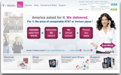
There was a time, when T-Mobile had the stunning image of Catherine Zeta-Jones holding a mobile phone to her ear, put up on their web page. It was a compelling picture and was bound to draw visitors’ attention towards it, except that it left some customers feel exasperated, especially those who wanted to see how the phone looked like. It was a graphic that helped to create frustration and not conversion.
People purchase products to look for better versions of themselves. They want to understand first how a particular product will benefit them before they proceed to purchase it. Hence, visual demonstration of product features will not be sufficient to win them over. The image should be able to convey the list of attributes that identify why your service is unique from the rest. The Fitbit Charge product page does not start off with a feature list. Rather, it begins with the visual display of the value proposition that show how the different features of the product will make a difference in the lives of the users.
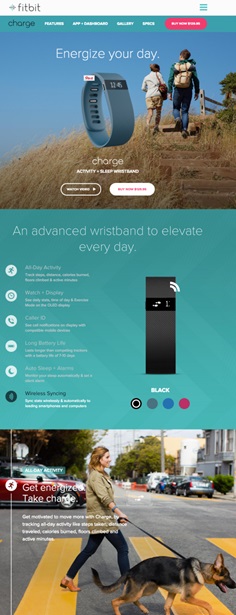
It’s like telling people that they need to buy a quarter inch drill bits because they want to make quarter inch holes or a toaster with big slots so that they can make bagels.
Different websites will have their product images implemented in different ways. While some may follow a direct approach where the images are put up with short product descriptions, others are seen to create elaborate pages with fancy codes and moving parts. However, there is no way denying the fact that modern usage of product images have changed to become more interactive than before. Service pages now have an improved design layout that are capable of holding a customer back longer and boosting up sales conversion.
Some of the Best Practices of Using Product Photography Appropriately for Web Service Pages
#1 – One Photo is not enough
Multiple images give customers a chance to see the product the way they want to see it. The product images must include everything that will make a customer fall in love with a particular product. Some of these details will include –
- The size of an item
- How it looks from different angles
- What are included in the packaging
- Whether there is any additional feature – like the number of pockets, assembly, etc
Begin with the hero image when you add multiple photos in serial order. The hero image is the front-shot picture that will stay on the top to represent a particular product. There are exceptions where the hero image are seen to be taken side-ways or from 45 degree angle. It is under the hero image that you add the rest of the photo series to help a customer view a particular product from all sides. These are called the Poplets, which will include special features like the textures and image demonstration from alternative angles.
#2 – Bigger Images are Better
Bigger images are image-focused and allow customers to glean product features in detail. Big pictures go a long way in addressing certain customer question that is otherwise not generally answered in product description.
It is the desire to look into the details that make bigger images more engaging. Some of the key advantages of using bigger images for product pages are –
- Eliciting positive visceral responses capable of captivating audience engagement
- Assigning visual weight based on prioritization
- To define product features and service specialty
- Giving customers reason to spend more time exploring a particular product
Bigger images give people the chance to inspect the smallest details and learn more about it. Even the little ‘M’ indent visible on the back of the phone in a Moto X advertisement has a visual appeal for some customers. It entices them to convert.
#3 – Real Images Don’t Fake It
Don’t kill your website design by using stock images or pictures that don’t have any relevant content to look at. Users do not pay attention to pictures that look like banner ads. These look unethical and fluffy that is good for nothing, apart from being decorative.
Customers have grown savvier than ever before. When they look at a particular product, they are likely going to visualize your product according to their needs and circumstances. By adding real photography, your website helps to make their shopping easier by providing them a real-life user experience that will help them to decide. You can try creating your own stock images with real photography too. Go ahead and try designing one using photo editing software like Photoshop. That’s more fun and innovative and has something real to add to a design you know.
The Bottom Line: Good Photography Can Add More Business Value to a Website
Visual product contents are interactive demonstrations that help to convey thousands of words and present them in the most stimulating way that is relevant to a particular task at hand.
The relevance of good photography is that, these are capable of driving conversion that talks about the real ‘YOU’. These add a unique personality to a web design that is hard to do with stock images. Well composed images come composed using the right quality, tone and mood that allow you to maintain a level of consistency throughout a brand service.
Therefore, it is okay to go ahead and invest in good photography for your website’s product pages. Combining it with the right design strategies will help to add a value that will justify your investment and which customers will appreciate you for. As sweet as a pie!
Image Courtesy: pixabay.com


