What makes a good e-commerce product page?
Well, almost everything!
The product page is the central path of your e-commerce business. If I am going to look at the hierarchical structure in which an e-commerce merchant tries to direct a customer’s attention down the conversion funnel, then this is how I am going to likely draw the picture.
The Hierarchical Structure of a General Website Page
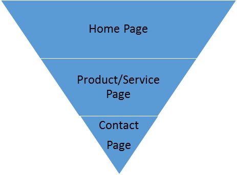
Note: I have left out most of the pages like the About Page and the Blog Page. The objective here was to give you a general idea as to the intent behind a website structure. Each structure is a stage that passes a visitor on to the next stage.
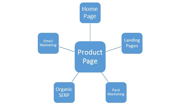
However, it is the product or the service page that forms the pivotal of every stage. No matter which page your customer lands on, the ultimate goal is to make your customer convert, for which the product page is an essential page that bridges the rest of the pages. Below is another diagram to show you the pivotal connection that a product page has with the rest of the rest of the marketing strategies of a website.
Moral of the Discussion: Product Page Design is an Important E-commerce Component You Cannot Ignore!
Showcasing a product to the customer is an art. You need to have the essential traits to make your customer feel inclined towards your product. I draw this statement from the traditional lines. However, the hypothesis is the same when it comes to the e-commerce website product page.
The product page, therefore, needs to be descriptive, interactive and effective when it comes to influencing a customer’s decision to convert. It needs to have all the elements that a customer will look for when it enters a product page. I have used Best Made’s product page to show you –
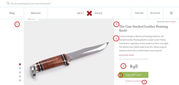
Take a close look at the features that make this product page. What is the first thing that will catch your attention when you look for an item and click to proceed with your purchasing decision? Based on a general behavior pattern, I have marked out the individual features accordingly. Can you spot the connection?
1 – The Product Image: Almost 67 percent of all attention is directed towards the product image when compared to product description or the product price. A product image can effectively communicate all the product details to the customer.
The product image is also helpful for shoppers trying to ensure that the product matches their expectation be it the color, size, quality, etc. Learn more about what people love about product images by clicking here.
2- The Title: Believe it or not but the title of a product is what grabs the customer attention next.
A product title is different from the usual catchy titles that you write a blog or an article.
When a customer looks at a title, he or she will try to identify with the term that he or she is familiar with. In that case, your product title must have a keyword that makes your product identifiable to the customer. You must have a straightforward and simple approach when you are writing a product title and must present it as it is. No jargon needed.
However, there are a lot of websites that add adjectives next to their product names or specific keywords to make it more interactive to hear.
3 – The Product Price: If you had thought that the product description should be the next thing that the customer looks for, it is time you rethink. Like most, you would argue that where else would the customer look for further details about the product other than the product description itself.
My point of the argument is why would the customer look into the product description if the product title serves the purpose already? In that case, is the product description not needed?
Of course, it is. A product description will tell you about its usage, quality, origin, varieties. You might not need to look into these details right away. What you would need to learn immediately is whether it is available and if yes, what is the price. Isn’t that right?
4 – The Product Description: After you are done with the product price, you will retrace your steps back to the place below the product title. That product description that is. It’s time to look into all those extra details once you are done getting the basic information.
5 – The Call-to-Action Button: The Call-to-Action Button or the CTA is the final step to customer conversion. This is the last and final element without which a product page is not entirely functional. The customer clicks on the CTA button, which takes him or her to the checkout page before finally redirecting him or her to the home page or back to the product page.
So if I am to take all these features into consideration and observe a visitor’s observation pattern on a product page, I would decipher a hypothetical heat map like this –
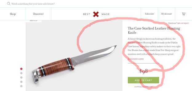
Follow the red path starting from the product image and you will understand how the customer’s eyes move around a product page, which explains the importance of placing different elements at specific places.
These are only the general features that you can find on a product page. There could be other factors like for instance the product size and color. In that case, customer observation patterns may vary. According to my hypothetical understanding, if I am a customer, this is how my eyes would hover over the product page –
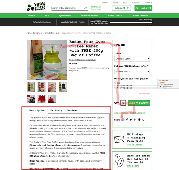
I have used one of York Coffee Emporium’s product pages to demonstrate how the heat map would be. The customer behavior pattern starts from the product image, follows the product title, the product options and finally stops at the checkout point that is the CTA button. What happens after the CTA button is the post-conversion metrics and from here we can consider the strategy for customer retention.
You may also notice that the product description is located below and does not directly fall in line with the way the hypothetical customer observation pattern goes.
What concludes is that a product page needs to be designed so that it can encircle both the processes of customer conversion and retention. And when we speak of customer retention, there are other features that come into the picture of a product page.
Essentials Features of Customer Retention on a Product Page
- Social Media Links
- Subscription Links
- Search Bar
- Other Related Product Links
- Breadcrumbs to other pages of the website
Conclusion
With that, we conclude our discussion here. A lot of thinking goes into designing a product page. Following customer observation behavior pattern will tell you a lot about how to design your product page. But if you are still not sure where to begin, our web design experts are always there to help you out. Feel free to call anytime.
Image Courtesy: Pixabay.com