Many small-scale businesses rely solely on email newsletters to build healthy relationships with their customers. A well-designed newsletter can be a powerful email tool with multiple benefits, which is exactly why it is crucial to make sure the design looks visually appealing to the audience. If it’s good to look at, your readers are more likely to click on it.
To help you get started on your marketing campaign, we have come up with a few expert newsletter designing tips. Here, have a look.
- Where you should start
Before you get started on your design, you will need a tool for easy distribution of your newsletters. Although you have almost unlimited options in the market as far as this tool is concerned, my suggestion would be to go for MailChimp or Campaign Monitor because they are the best and the easiest to use.
Both of these tools offer simple campaign and list management systems making templating nothing but a breeze. They also have a great analytics option so you can measure how your campaign fared in the long or short term.
So give them a try. Their prices don’t bite.
- Figure out your target audience
There are many ways of using a newsletter depending on the type of business you are in. For example, you can use them to notify people of a new service that you are offering or to update an existing one. Or you can also use them to give your audience a shout about previews, discounts, exclusives, and other similar offers.
So before you delve straight down to your newsletter design, it is important that you nail down exactly what you are trying to achieve. You will see things ease up a lot after that.
- Decide on the format
There are many ways of constructing your own newsletter template. But how you go ahead and do it will primarily depend on five things such as:
- The type of email clients you would want to support,
- The type of browsers you would want your newsletter to support,
- The type of mobile devices you would want your newsletter to support,
- Whether you would want to provide a “view in browser” option or not, and
- Whether you would want your newsletter to appear differently on mobiles and desktops.
Researching other newsletter formats can also be an excellent way of deciding what can be the right one for your product, brand, or your audience.
- Start with a header
It’s a no-brainer to say that your newsletter should start with a header. It is the equivalent of a newspaper, website, or magazine name.
Your header should sit at the top of your newsletter and should also have the newsletter title (in case you have one), your company name and logo.
Fortunately, plenty of online tools are available out there that can help you with your headers, including the likes of Pixlr and Stencil.
With these tools, you would not require any extensive graphic designing experience to create and save graphics on your PC. Just create your header once and use it again and again.
- Use your company logo to decide on your colour scheme
Every newsletter requires a colour scheme.
Since you have already included your business logo as a part of the header, consider using its colours throughout your newsletter as borders, font colours, or various other elements.
After all, the colour of your logo should always be the colour palette for your branding, and this should be no different either.
- Use standard fonts
When selecting fonts for your newsletter, your top priority should be legibility.
Stick with easily comprehensible fonts such as Times New Roman, Calibri, Arial, Raleway, Helvetica, Cooper Hewitt, etc.; ones that can be identified in a jiffy. Avoid fancy intelligible fonts in your design because they can ruin the entire purpose.
It’s also advisable to maintain consistency. Refrain from using different fonts in one newsletter. Too many fonts give a disorganized, cluttered look that can be heavily distracting to the reader. Go for one or two fonts (at the very most) for the best result.
- Make sure to have interesting headings and story titles
Titles and headings are critical and are undoubtedly a bit tricky to master.
Take careful note of things capable of capturing your attention when you are browsing a newsletter or a webpage. What draws you in? Pencil that out first. You might have a brilliant article but if your title’s not compelling enough it may very well go down the drain.
In short, I should say content and headings are almost as important as the design in itself.
- Stack your content
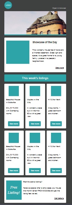
If you are using a pre-created newsletter template through an email service provider, you will be able to add content easily. But if you are designing the whole thing from scratch, make sure you follow the steps highlighted below.
To make a layout look good to your user, you will have to ensure it can be scrolled smoothly on mobile devices. So stack your content in chunks with the most important one on top. Here’s an example for your reference:
- Use images
A well-designer newsletter typically has a good balance between text and pictures.
When a recipient opens your mail, images instantly grab his/her attention. By adding a few relevant photographs to your newsletter, you can enhance the effectiveness of your message that you want to send at one and the same time.
Note: Nowadays, some businesses embed videos or movable GIFs into their newsletters, but this may require a bit of technical mindset. So think carefully about the kind of audience you are aiming at before taking this leap of faith.
- Lastly, tell a story
Sharing your personal story as a project or a company can be an exceptionally powerful way of finding out people who want to be a part of your story too. This can also have a long-lasting impression on them benefiting your business a lot in the long run.
So be a bit more creative and imaginative with your design. There’s no rule that says a professional newsletter has to be a dry list of links and nothing more.
With that, I will sign off finally for the day. Hope you had a good and enlightening read.
Image Courtesy: Pixabay.com
