Banner ads are considered to be the most prolific marketing methods used in the online digital marketing world. Almost all companies use them because they are an effective and inexpensive medium to increase brand awareness.
But how can you create a killer design to make your banner more attractive? In here we have compiled a list of 11 design tips that might come in handy.
- Implement the standard banner ad sizes in your designs
As per Google Ads, the most clickable ad sizes are:
- 336×280 (Large Rectangle),
- 300×250 (Medium Rectangle),
- 728×90 (Leaderboard),
- 160×600 (Wide Skyscraper).
Make your banners in the aforementioned sizes to generate more clicks.
- Maintain a hierarchy
You must realize one thing that banner ads are mainly designed to increase brand awareness and drive people to a website. These ads must have three basic components:
- Company logo: The company logo must be present somewhere on the ad to build brand awareness. The logo should be easily noticeable but should not dominate other important aspects of the banner like the value proposition and the call for action button.
- Value proposition: This is the most important part of the banner because it actually showcases the product/service to the people and calls for their attention. For example: “50% DISCOUNT”, “FREE”, etc. Your design must make these things look unique and easily noticeable.
- Call for action: The call for action is usually represented by a text button representing something like “Click Here”, “Watch now” etc. Don’t forget to include that in your banner.
- Keep the design of the ad simple and easy on the eye
A visitor won’t probably spend a reasonable chunk of his/her time on your banner. S/he’ll probably give your banner only a couple of seconds and move on. So ensure that your banner is designed in such a way that it gives away the point within that short time frame.
Keep your banner simple both design-wise and content-wise.
- Use appropriate buttons on the ads
Buttons can increase the CTRs (click-through rates) when used appropriately. But that depends on the type of banner ads.
If you want to add a button on your banner d, place it at the end in contrasting colors. Also, remember to maintain this consistency in all sets of your ads.
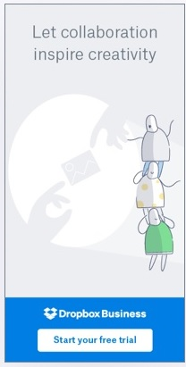
- Ensure that your banner possesses a clear and defined frame
People’s eyes are naturally attracted to any subject placed within a frame. So it’s mighty important for your banner ads to have a definite frame to grab the attention of people at moment’s notice.
If you banner ad is white, it is a common practice to have a 1px gray border around the banner. Here’s an example for your reference.
- Your banner ad text MUST be instantly readable
Just follow these two dos and don’ts and you’ll be sorted.
DO: Ensure that the text headline and the text body are in different sizes. Things that are significant must be highlighted in a stand-out way. Remember you have only 2 seconds to grab the attention of your readers.
DON’T: make sure that you DO NOT use script fonts, cursive fonts or the fonts that are extremely thin and crammed in comparison to that of the others in your banned ad text. (You can use such fonts in designing the copyright notice or a disclaimer though if you want to give one.)
- Use the appropriate file formats
You can deliver your banner ads in various formats such as:
.JPG,
.PNG,
.GIF,
Adobe flash files.
It’s usually expected that you’ll be working on your designs in Photoshop or Adobe illustrator or flash. A point to know at this point is that flash files aren’t supported by many devices.
So it’s a good practice to make your ads in a .GIF format. By doing that, you won’t be missing out on any potential clickers.
- Small file sizes are a big thumbs up
The smaller your file, the better it is. According to Google Ads, it’s better to keep your banner ads under 150kb for maximum effectiveness and maximum reach.
Your ads must load as fast as possible on devices and hence, the smaller they are, the faster they will load.
- Give your viewers a sense of urgency
Things like “Only 3 more days”, “Limited time offer” instill a sense of urgency in your viewers to check it out. Try to incorporate this tactic in your ads depending on the circumstances.
- Consider putting in animation into your ads
Animated ads generally outperform conventional static banner ads. You may consider incorporating the same idea in your designs.
But do ensure the fact that the animation doesn’t distract your readers/viewers from the primary message conveyed by your ads.
- Use colors wisely
Every color is associated with emotions and that is exactly what you should try to evoke in your audience.
You need to study your target audience when making your color palette. The below list can come in handy.
- Red: typically symbolized anger, excitement, passion, and love. It is attractive to most audience but should be sued in moderation. If you are going for that classy look, avoid.
- Orange: Symbolized playfulness. It is not overpowering as red but still exudes energy.
- Yellow: Friendliness and cheerful – yellow sends a lot of energy to your audience.
- Blue: The corporate color of clarity, safety, formality, intellect, serenity, and trust.
- Pink: This one is mainly associated with femininity, youth, babies, and love.
- Black: This one is traditional and symbolized mystery, modernity, exclusivity, luxury, prestige, and power. Black on white is the most readable combination of colors.
- White: Cleanliness, sterility, purity, honesty and innocence – white creates a feeling of economic sense in your audience.
So, that’s pretty much everything you need to know for designing your banner ads. With a little bit of improvisation and imagination, you will definitely improve in your design endeavors. Best of luck!
