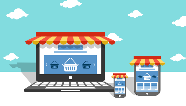
You might think e-commerce is no longer as talked about as it happened to be earlier. You’d be wrong in thinking this; the e-commerce segment has lately gone silent. But that doesn’t mean it has stalled experiments. On the contrary, I must say, experiments are going on at full swing.
Let’s consider the 2015 web design trends for the ecommerce industry. Not all design trends, predicted by the experts prior to the beginning of this year, showed up. Some did show up, but not all. Then again, some have proved themselves exceedingly useful while others have failed in doing so.
In this article, I’ll discuss the web design trends of 2015 that have been leveraging the ecommerce segment. I’d like to begin with
Flexible typography
I have been digging into typography lately. It’s been enriching my knowledge. Earlier, I was like others, who think font selection is just another requirement when someone designs a website.
But I was wrong.
Typography in 2015 is a serious concern for all industries including e-commerce. Flexible or responsive typography fits an e-commerce website perfectly; it assures fluidity, which an e-commerce site needs the most because user-experience heavily depends on layout designs and appealing typefaces.
Responsive typography offers an experience, which is bigger, better and brighter than non-responsive typography. The three Bs ensure better readability for e-commerce websites.
Hidden menu
When you are on the desktop platform, it’s difficult for you to comprehend the importance of the hidden menu; it’s a part of mobile site design. Product navigation is an example of hidden menu. An ecommerce site needs to offer its visitors the opportunity to navigate through products; this feature is called product navigation.
Since most handheld devices have small screens, the homepage of a site may not display product navigation, and keep it hidden. The icon representing hidden menus is three horizontal bars. Once a user clicks on the icon, it shows all the navigation menus that are apparently hidden from his sight.
The hidden menu offers the following benefits to an ecommerce website:
- An uncluttered browsing experience: As the navigation stays off the screen, it allows for the optimal use of space.
- Better accessibility: A site with hidden menu offers better accessibility. Users surf through the site and access various information because they can make the full use of the screen.
- Better functionality: Decluttering a website means making it it more functional. In case of hidden menu, it is always accessible no matter which page a user visits. Hence, the site’s functionality increases alongside its accessibility.
A site with the said benefits accounts for better engagement, which, in turn, results in escalating sales.
Large image size
The size of the product image matters. The bigger the image, the better it is for an e-commerce site. It guarantees the following two things:
- A positive user-experience
- A more appealing visual design
When it comes to content, e-commerce sites are often thin. Through product images, the site can convey visual details to audiences. For example, a larger image on a toy manufacturing company’s website informs prospective buyers what the company can offer them in ostensive manner.
The guidelines for e-commerce usability design heavily emphasize on images. More often than not, users get ideas of product specs by taking a look at images. As a matter of fact, that’s a reason product photography has become so popular lately, and app developers have been developing apps for it. A large product image on the homepage serves an e-commerce site by helping it communicate and bond with its visitors.
Smooth checkout and discounts
Buyers prefer a simple checkout process. They also prefer a mammoth discount. In 2015, designers can offer them both. In fact, a user can avail both at one go. A site can feature an engaging banner that users can see on the checkout page. The banner will show them the amount of discount.
The use of coupon codes can make this process simpler. A buyer only needs to enter his login details, and he’d be entitled to the discount even before accessing the checkout page.
Online retail
E-commerce is one type of online retail. There are other types aside from it. The design experiences for OSCommerce or Social Commerce are different. The four trends that I’ve discussed in this article can create experiences, favorable for e-commerce.
Image Courtesy: marketingdigest.com


