With startups popping up at every corner you turn, portraying ideas and embodying creativity has become much easier. But not all startups are founded by a design pro or a highly experienced professional. This is where they fall short. However, online prominence of these companies becomes a priority on account of their requirements regarding knowability quotient and effective canvassing.
Some of the web design staples of startups have witnessed huge success over the years, whereas some fell short of the limelight. Part of this is owing to the fact that some design trends have the power to bolster business, while some can drag them down in Google search results.
With the blooming of new leaves and the refreshing spring essence arriving in the streets, it is time to dump our old and wrinkled ideas and head for the hit.
Make it simple
With design, you need to keep two things in mind:
- Less is more
- Your design should make lives easier
You need to get over loading your website with graphics, choices and options. They tend to confuse the user and ruin the whole point of it. A simple website interface can be appealing and easy to navigate. However, you need to consider the following aspects while breathing life into your design idea:
- A strong visual hierarchy can enhance user experience. Make the primary buttons bigger, the color more noticeable and the number of titles fewer.
- Pay close attention to color. Pick those that work well together and do not end up creating a mess of color splash on the screen. Do not make a rainbow-y pool party of your design.
- Redundancy is a bore.
Pay more heed to your color palette
Let’s elaborate on the color part a bit more to make myself clear. Think Starbucks. A moss green color comes to mind with the refreshing aroma of freshly brewed coffee. Now think Facebook. You get images dark matte blue with the thought of friends waiting for your recent Malibu holiday pictures update. Beaches never go out of fashion, do they? The point here is, the biggest names have utilized the color palette of design as an active sales tool. You can, too.
For the primary colors, try sticking to a meager one or two and neutral hues for other graphic elements like icons, boxes, lines etc. Now build on it. This way viewers will be able to relate your company to a certain color or two. Even though it might take some time, it is not unattainable.
Go basic with navigation bars
When it comes to navigation bars, ask yourself the following questions:
- Is your navigation bar swimming all over the place?
- Is your navigation bar hiding behind an idea?
- Are you getting too creative for the navigation bar?
If your answer to all of the above questions is in the affirmative, then you can be in serious trouble. People usually have a certain position reserved in their minds when they look for a navigation bar in the website page. It is like an intuition. Quite often, the header is what they look into, sometimes the sides work too. You know you are way out of line when you get an idea that your website viewers feel lost in the ocean without a compass. Simple is the way to go.
Quick Tip: Convenience and usability always trumps creativity
Stun with images
Did you know that people barely wait till the blink of an eye for an image to load? So the big image you were rooting for to place in the landing page of your website could cost you some valuable visitors if not sized correctly. This is because with big images comes big problems like slow speed and improper loading.
That being said, it is also important to look into the aspect that states that a picture is worth a thousand words. A picture grabs attention and can communicate with viewers, emotionally. Make a mental note of the target audience and dedicate some time researching stock photos to connect with them on a visual level.
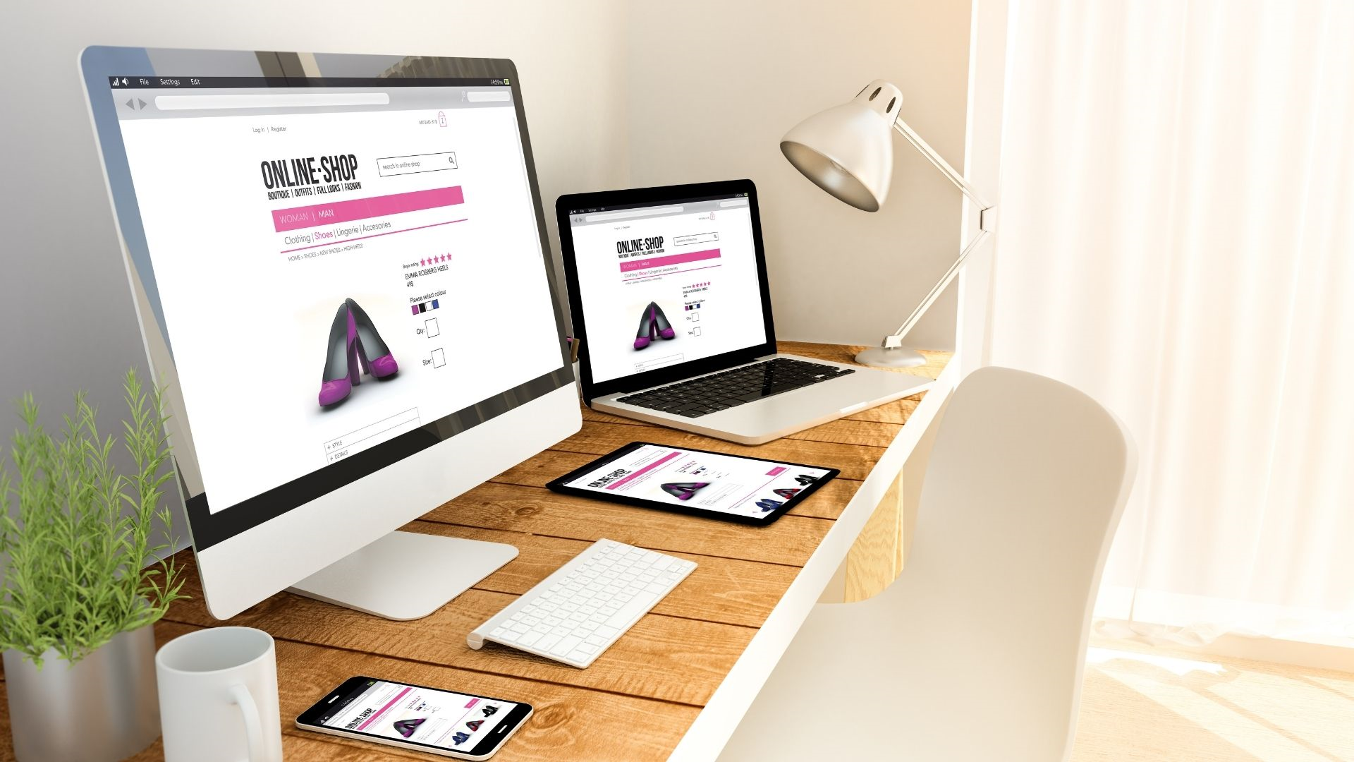
Responsive design is a commodity: Embrace it
According to Business Insider, people used to spend a hefty 80% of their time on mobile apps in 2013. Oh wait! That just plummeted to 86% in 2014. It wouldn’t be rocket science to guess the percentage increase in 2020.
People spend more time browsing the internet on their mobile phones or tablets, than they do on their laptops. We recommend you to use a simple form and distinct ‘Call to Action’ buttons for the mobile version. You can consider keeping the creativity under a dignified leash for the mobile-version, but feel free to let it flow for a desktop version.
Some DIY platforms like WP and Wix come with built-in responsive design so that you can build one and forget about it. However, an aggressive mobile design strategy, no matter how thrilling it sounds, might not actually be what your startup needs. An informal poll or engaging a focus to identify the requirement of your company’s mobile app would be a great way to start.
Prioritize your end user
The human brain is wired to pick up information from anything it comes across on the fly. It has the power to absorb cues from daily life, its own internal musings and overheard conversations. It keeps the things in mind that are important and blocks out the rest. Now the question here is, is the web design of your startup thought-provoking enough to be remembered?
Users need to be able to connect with your designs. Your designs should be able to solve their problems and affect their lives for the better. All you need to do is, design for the user because at the end of day, they would be using it, not you.
There’s this nice quote which I read somewhere. It goes like this: “I’ve learned that people will forget what you said, people will forget what you did, but people will never forget how you made them feel.”
Your designs will influence how they feel about your startup and eventually, the services. People need to feel welcome and should be able to relate to your designs. Humor them, speak their language, surprise them, delight them, because if you are not doing all that, someone else already is.