Paul Rand, possibly the greatest graphic designer on the planet and the genius behind the logos of UPS, IBM, Westinghouse, and others had this to say about logos:
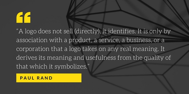
Now, that’s undeniably a lot of power for a singular piece of design to hold on its own. As a result, most graphic designers approach these projects with a mix of dread, thrill, fear, anxiety, and pride.
Luckily, we have a few golden principles that can help in the development of engaging and enthralling logos, six of which are covered in this post.
- Simplicity
The best logos are the ones that give your viewers an immediate sense of your business; ones that are clean, uncluttered, and can be understood in a jiffy.
The thumb rule to follow here is: “Less is more, and simplicity counts the most.” Here are a few popular examples:
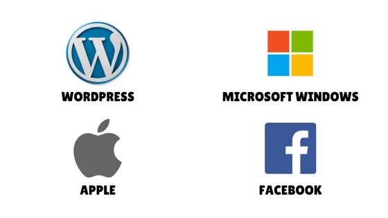
While designing logos, you must remember that they are used in a variety of ways, in different formats and sizes. As a result, fine details may be lost.
An impactful logo must come with few elements, each of which should be understood in a split-second for maximum efficiency. If your design comes up with cluttered elements contributing nothing to the underlying meaning, get rid of them without any further ado.
- Classic
Just like that classic black dress, your logo has to be timeless.
Popular trends such as contemporary fonts and styles can become a burden when the trend wears off after some time. The advice, therefore, is to focus on your brand than what the latest trends stand for.
After all, you would definitely want your logo to be able to withstand the test of time; would you not?
Note: As far as classic and timeless logos are concerned, nothing suits our category more than the one of Coca-Cola. It was created over a century ago; yet, the design is still appealing and relevant to their current business model and revenue. What a masterpiece!
- Memorable
A logo should be such that it can be recalled quickly even after a glance.
After all, you need to realize that a glance is typically all your logo’s going to get from most of your people.
Like any other symbol, a logo should stand for something singular. If a person takes a quick peek at it, s/he should be able to instantly describe its essential elements, such as:
- It’s a man with a pizza, or
- It’s a cat with a rat, etc.
A logo that is fussy, complex, and designed with multiple parts may confuse the viewer and hence, should be dismissed at all possible cost.
- Versatility
One of the best things that you can do to your logo is to give it the power of versatility.
When designing our logo, you need to be mindful of its usage. You’ll have to resize the logo onto various surfaces and materials, such as banners, letterheads, or even business cards. It’s therefore, necessary to pick a design that works effectively at almost any size.
The same advice also goes for color. If your logo’s heavily reliant on colors, it may not work well in a forcibly-imposed black and white condition. Versatility’s the only thing capable of making your logos work in any occasion.
- Freshness
Never ever settle for a “me-too” design. Try to come up with a fresh new concept and design to gain more impressions in the long run.
Do a quick research of logos in your industry and look for a pattern. If you find one, avoid mimicking it to the best of your ability. For example,
If you are designing a logo for a telecom industry, you will see a host of logos featuring technology and globes. If you are designing one for dentistry, you’ll see logos of smiles or teeth, or even both.
Now, they all make sense; there’s simply no doubt about it. But if you walk willingly in their footsteps, you will lose all hopes of getting noticed among hundreds of others working exactly like you.
- Suitability
What is a brand without a story?
You would definitely want to build a strong connection with your consumers by telling them a brand story; one requiring a deep understanding of your audience.
After you have made an in-depth research of your audience, you will have a better sense of colors, fonts, and graphics to use. Remember, your logo must be catered to your target audience, and suitable for the business. So do accordingly.
What should your logo ultimately stand for?
Logos are nothing but symbols, and as such, they should tell people what you hope to mean to them.
Understanding the meaning of your brand and prospective value to your consumers can help you pinpoint what you stand for or what you should stand for. If you are unsure, ask yourself (or better yet, ask your customers) this question — “what makes your business better than your competitors?”
Depending on the answers you get from the above survey, your competitive edge can be authenticity, precision, particular attention to detail, speed, variety, intelligence, good health, coolness, intelligence, power, elegance, efficiency, and innovation.
The design of your logo must incorporate all these things for maximum efficiency. For example,
Take a quick peek at the logo of Apple.
What does it signify?
Firstly, it signifies a half-eaten apple; one that is easy enough for people to understand even at a single glance. Next, it reflects the thinking of the company and the ways their products perform: artistry, simplicity, and exceptional user-friendliness. This helps to create an inherent connection between your audience and your brand which plays a significant role in increasing your brand value, on the whole.
For your logo to do something extraordinary in the long run, you must first understand the value of your company and its impact on your consumers. Then, by following the design principles highlighted up above you will have something to stand for. With that, we’ll sign off finally for the day. Hope you had a great read.
Image Courtesy: Pixabay.com

