You have a business and you’ve created a website for it to establish an online presence. It surely delivered excellent results in the beginning. However, the design’s benefits have waned gradually with the passage of time.
Why is this happening?
To get the answer, you must ask another question.
How old is your business website? If it has been quite a few years, this might be time to revamp your website. So, you must engage in website redesigning.
Website redesigning differs in many ways from designing your website. So, it’s important for you to keep the major things in mind while engaging in website redesigning. Besides, there are quite a few common mistakes that occur while redesigning a website. You must avoid those mistakes.
Here’s a quick look at some of the most common mistakes to avoid during website redesigning.
Not Being Clear about the Purpose
Why are you planning to redesign your business website?
You must have a clear answer to this question before you go forward with the plan of revamping the site. It makes no sense to redesign a website only because it has been around with the same design for a long time. Instead, you should look forward to changing the design in such a way that it gives you more leads. You can also plan the design change to ensure better user experience at the site. In short, you must have a clear idea why you’re redesigning your website. Remember, with a redesign, you can get:
- increased traffic
- increased leads
- increased customers
Plan the design according to your objective. Have a clear idea about the purpose, so that you can give it necessary tweak whenever necessary.
Focusing More on Aesthetics than Functionality
What is your primary focus when you’re planning to revamp your website?
In most of the cases, it is important to provide an amazing user experience. So, the process of revamping your website must be focused on it. However, when you’re redesigning the website, you will always feel the urge to ensure that the website is excellent to look at.
Aesthetics is extremely important for any website. However, remember that it’s not the most significant thing to focus on when it comes to redesigning your website. You must focus on ensuring that the user experience is improved when the designing is over. It is likely to help you decrease the bounce rate of the website and ensure that it performs well.
Not Including the Content Strategy in the Plan
Is your plan for redesigning your website ready? Have you included in the plan how you are likely to keep the content on the site?
Remember, it’s not the design, but the content for which the visitors are likely to land on the website. So, you must focus on presenting the content in a proper way. It’s essential to design the website based on the content, and not the other way round.
When you include the content strategy in the website redesign plan, you can remain assured that the content of your website is going to be as important as it used to be. Only the look and feel of the website is going to change.
Embedding Text in Images
How are you using text while redesigning your website? Are you looking to embed it in the images to make it look beautiful? This can be a major mistake on your part.
It is essential not to use text embedded in the images to ensure that your site ranks high.
Want to know why?
The Google spiders or the bots can’t read texts that have been embedded in images. So, it’s important that you use the text in a proper way and don’t embed any text in images. Otherwise, you will lose out on the chance to see your website rank high on keyword search results.
Using Large and Heavy Images
Are you using lots of images for redesigning your website?
Images, if chosen properly, can surely improve the look and feel of a website. However, you have to select the images for the website in a prudent manner. Ensure that they don’t have an extremely large size. Instead, you can select small images, which can be uploaded easily.
Want to know why?
The large images can increase your website’s load time, thus surging the bounce rate. So, you must ensure that the images that you’re using for the website redesigning are small and properly optimized for online use.
Not Designing for the Mobile
For whom are you redesigning your website?
While redesigning, it is extremely important to keep the target audience in mind.
Are you redesigning the website thinking that only the users with laptop and desktop computers are going to use it? Think again!
With every passing day, the number of mobile internet users are increasing significantly. In 2016, mobile internet usage has overtaken the amount of use of the internet through the desktop.
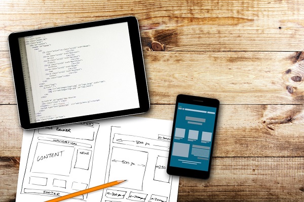
So, it is extremely important to design a mobile version of your website if you’re planning to revamp it completely.
Conclusion
As web design is an ever evolving process, you have to think of redesigning your business website once in every few years. During that time, you must keep the trends in mind. Moreover, you should not commit the common web design mistakes, which can completely mar the impact of changing the design of your website.
Image Courtesy: www.business2community.com


