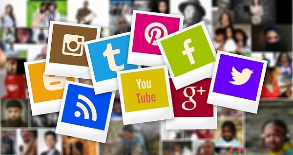
It is no secret that visual content is the key to social media engagement. After all, right from the early human civilization, we are, by instinct and nature, visual beings.
In our brain, around thirty percent neurons of our cortex are dedicated to visual memory, eight percent for touch, and only three percent for hearing. Thus, you can easily imagine to what extent visuals and images appeal to the human eye.
That is precisely the reason visuals play a vital role in content marketing. If you want to increase our brand awareness on social media, you will have to share value-added content. How? Fundamentally through attractive visuals.
There are quite a few useful criteria and tips that should be taken into consideration for creating graphics on social media. This post will throw more light on the matter.
- Pay particular attention to colors
Almost 90% of product judgments are done on colors alone.
So naturally, you can see that color is one of the most vital and complicated aspects of any social media visual. It helps in setting the mood, creating an atmosphere, conveying emotions, and even evoking powerful experiences from the past.
Try to use colors in your social media graphics that can guide your audience through a story. Here’s a quick rundown of how colors can affect our brain and how they can be used for social media marketing:
- RED: To symbolize urgency or energy.
- ORANGE: For aggression.
- YELLOW: Youthful and optimistic.
- PINK: Feminine and romantic.
- BLUE: For denoting trust and security.
- PURPLE: Calm and soothing.
- BLACK: Sleek and powerful.
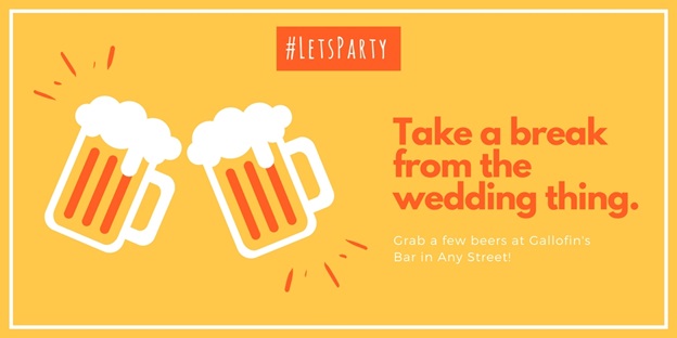
- Utilize transparent overlays
This is a useful trick for when you want to use a relevant image in the background and still want to ensure that the text over the image is easily readable. Here’s a case in point:

You can do this in Photoshop simply by adding a layer filled with a solid color on top of the image. You can then turn down the opacity of the layer until the visual looks right.
You can even do this on Canva, one of the easiest online graphic designing platforms. Just add a shape (a square or a rectangle according to your resolution) on top of your image, change the color to your preference, and turn down the opacity to around 60%.
- Use funny icons to visually reinforce your message
Vector icons can be an excellent way of enhancing your visual message.
Depending on the message, they can be used to add poignancy or humor, thus, increasing the emotional impact leading to more number of engagement on social media. Here’s an example for your reference:
![]()
- Master the art of balance
The art of balance of social media designing is undoubtedly a tricky one to master. However, if you manage to get the hang of it, it will benefit you a lot in the long run.
A great way to think of the balance is to imagine that every element in your design has a certain amount of weight behind it. So now if you place the image on a scale, will it tip to one side? If the answer’s “no,” you have got the balance right.
Note: It is also important for you to remember that the balance doesn’t always have to be split through the middle. After all, there are different types of balance that you can use to varying degrees in your design:
- Asymmetrical,
- Symmetrical,
- Crystallographic,
- Radial (imagine a spiral staircase).
- Don’t forget your logo
The presence of a logo makes it much easier for your audience to relate and understand the graphic. This helps in creating brand awareness.
Suppose, if today you see an engaging post with a big “M” crafted in a familiar style in the corner, you will understand immediately that it’s from the McDonald’s.
Tip: Whenever you get an opportunity, include your logo in the graphic so your branding skyrockets in a matter of days, not even months.
- Have fun with fonts
Typography is nothing short of an art.
Selecting the right set of fonts that can work seamlessly together can help in bringing your social media graphic to life. It can also have a huge impact on how your design is received by people and more importantly, the message that your brand sends across.
One of the most important aspects that you should keep in your mind while selecting fonts for your graphics is readability. No matter whether you go for a serif or a sans serif font, or any other variation in between, ensure that your audience will be able to read the message even at a moment’s glance. These tips can help:
- Limit the use of three typefaces in your design at the very most.
- Use consistent font sizing that fits well on the medium you are publishing to.
- Serif fonts are typically good for print materials and sans-serif for the web.
- Kerning can be an impressive technique to use in the titles.
- Highlight hashtags with shapes
If you want to draw attention to the hashtag of your campaign, consider using a shape to set it apart from the rest of the image.
Here’s an example-
- Last but not the least, be creative and try to create a variety
There’s a range of visual content templates and ideas available on the internet. So it’s not like you are required to feed your audience with images and visuals every day. It might even get a bit too boring over time. So how can you solve this? By creating a variety.
You can share a variety of graphics on social media including the likes of:
- Top ten lists,
- Famous people quotations in engaging shapes and typo,
- Charts,
- Facts,
- Infographics,
- Screenshots with easily identifiable marks to make a point,
- Captivating photographs.
So that’s about it. These are just a handful of tips you can use to create engaging visuals for your social media content. And if you want to add to the list above, feel free to comment in the section below. We will be more than happy to hear from you.
Image Courtesy: pixabay.com