No matter how engaging your website design is, conversion is the first and last thing that will always concern you. And why not. After all, making a good impression on your customers is the reason why you invest so much time and money designing your website.
As a general rule, one should take great care when designing the structure of a website homepage. Target customers land the most on this page. A good engaging design will easily grab the attention of the target customers, but the next thing that will matter the most is how you have laid the structure of your website.
Business messages should be made easily digestible so that they can act upon it quickly. Therefore, you need to make sure that you have all the elements placed at the right spot. In this article, we have shared a guide to help you identify the sweet spots from where you can get the most out of your homepage design.
Identifying the Basics of Your Web Design Layout
Designing a web design layout is not about randomly placing the information as you like it. There needs to be a flow that will guide the customer to –
- Identify what your website offers
- Learn how you can do to help them
- Convert to get the solution that you provide
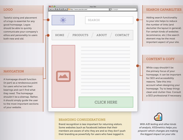
And to keep with the flow, there are certain elements that every website must follow to enable brand identification, effective communication, easy navigation, etc. How do you do that? Take a look at the following Kissmetrics image and identify whether your website has the following elements in the right place or not –

If yes then you are on the right track to kick start an effective brand communication. If not then you need to pay attention to the following elements and their placement on the homepage.
A website should be designed simple and clear such that the following elements are clearly visible. I’ll explain this using an example, but right now here are the elements that your website homepage should have –
- Logo
Logos are the first key to brand identification and communication. You need to design them keeping the conventional consistencies in mind.
For example, when you are placing them on a website homepage, make sure that they are situated where they are visually hit the customers’ eyes the first time they land.
Apart from proper placement, logo size and design also matters. Website homepages are responsive today and are accessible from any device. A consistent logo design should be able to work in any format no matter what format they are placed in – vertical or horizontal.
- Navigation
Website homepages should be like the sitemap that will help to usher the customer through the various pages available in a site architecture.
In most of the websites, the navigation feature is placed on the top in a horizontal fashion. Why is that? That makes a lot of sense given that a computer screen generally comes in a landscape format. A horizontal navigation is easy to place in a landscape format since it is less intrusive, easy to place and is well balanced from the perspective of design.
If your website has a horizontal navigation bar, then you will have a lot of space beneath the header area. On an average, you can have a maximum of eight links to the different pages of the website. But if you have more links to add, then the beauty about horizontal navigation is that you can add drop down sub-menus under each navigation button.
A lot of websites, however, have a vertical navigational feature. This makes you wonder which one to choose out of the two. Vertical navigations take up about a fifth of the website width. They look good and make navigation easier, especially if someone has to access a website from a mobile device.
Some e-commerce websites have both horizontal and vertical navigation features. It depends how you are going to use the navigation feature.
- Search Functionalities
Including a search box in your website makes it easier for visitors to search for specific results. But where do you place them on the website?
Following an insight study by Nielson Norman Group, when scanning the website, human eyes have a tendency to move in an F shaped pattern.
They first move across the top of the web page in a horizontal pattern, which forms the top bar of the alphabet F.
Next, they move down a bit before horizontally across the page for a short distance
Finally, they move further downwards and this is when the eye moving is generally seen to be in vertically striped pattern.
Placing the search bar right at the top of the page where the upper portion of the alphabet F is therefore an ideal decision. However, Nielson Norman’s theory does not always dominate the layout of all websites.
Sites like Primier Inn have a more detailed search box to help customers book their hotel room based on date, arrival and departure.
Sometimes the customer behavior is another factor that influences how a search box is placed on the website. Sites like Primier Inn and Amazon know that when their customer visits their site, they already know what they are looking for. Hence a detailed search box can help them find what they are looking for quickly without having to scroll through long pages.
But if you don’t know where to place your search box, then take the advantage of analytics guide. In fact, you can use analytics data to discover new possibilities of increasing your website’s search box usage and tweaking it accordingly.
- Copy and Content
Even though the copy and the content might not seem to be a primary factor when we talk about designing a layout, there are certain things that you cannot overlook. Such as – where do you place the most important message that is easily noticeable?
Therefore, understanding the upper fold and lower fold is therefore important. The fold is basically the standard page view that ends within a browser. Readers need to scroll down further if they want to learn more about a particular service.
Most of the times, readers are generally found to be accessing a website from their office desktop. This basically means that all important contents need to be placed above the fold so that visitors and views can easily come across the message without even making an effort.
Conclusion
It does not matter what kind of website you are designing the layout for. Almost all the websites follow the same pattern when it comes to web design.
Designing and developing an effective homepage is all about making a website easy to navigate and use. I hope the above mentioned principle elements will now help you design your website homepage layout efficiently. Need a web designer to help you design a web home page? Let’s get in touch today!
Image Courtesy: Pixabay.com


