You spend so many hours and money trying to make each and every part of your web design friendly.
So why leave the shopping cart design out of mind when it designing a simple yet engaging business website? After all, an e-commerce website remains incomplete without the shopping cart.
E-commerce Shopping Carts
With online shopping comes no dearth to choices. Customers can now directly purchase products from the comfort of their couch. A shopping cart is the little support that helps to turn customer conversion into maximum customer satisfaction.
There are many important features that make the shopping cart a positive aspect in terms of traffic building and business revenue. And therefore it is an important part of a web design. To some extent, the e-commerce website acts as an important CTA or Call-to-Action. That’s because –
#1 – An Important Purchase Decision Maker
Shoppers pick out products that they want to purchase or are considering to purchase. But some of them are not yet convinced or are unable to decide which one to purchase and which one to keep back.
The shopping cart is the holding area where customers will keep the picked out products and then make their final decision. An online shopping cart allows shoppers to review their selections, compare and check details before purchasing.
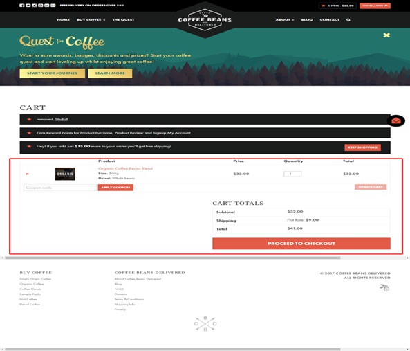
Coffee Beans Delivered provides a nicely detailed shopping cart page before the final check out –
#2 – A Medium of Exclusive Promotions
Sometimes customers tend to abandon their cart just when they are about to make their purchase. While it’s hard to understand why, some of the most common reasons behind a shopping cart abandonment could be –
- Complicated checkout process
- High price
- Compulsory sign up
Shopping cart abandonment is inevitable and sometimes an e-commerce merchant just cannot do anything about it. But then maybe a promotional coupon or code could do the miracle.
Promotional coupons/codes are great promotional mediums when it comes to winning new customers and surprising the existing ones. With a promotional coupon smartly integrated in a shopping cart, marketers can encourage shoppers to complete their checkout process.

Marketers can also be quite selective with their promotional offers. They can offer only selected customers if they qualify for a discount/promotion. In this way, as a marketer, you will not just help make your customers feel special but also help your website make successful conversions as well as long lasting customer relationship.
#3 – An Efficient Product Manager
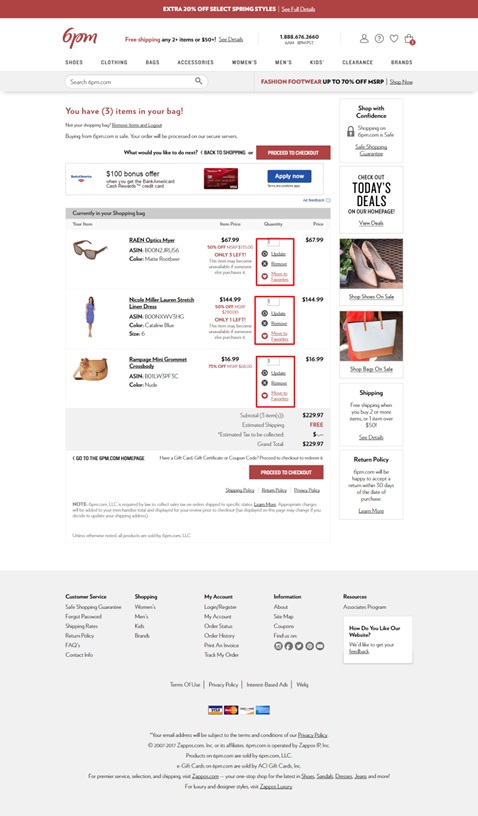
Often, there are times when customers tend to select more than one item. The shopping cart helps the shoppers by providing them a detailed view of the number of items they have added.
This helps the shop keeper to make any final changes in case if he/she changes his/her mind before the final checkout order is placed. It is therefore important that all shopping cart pages should provide easy options through which customers can edit/ remove items from their shopping list. A clear link such as ‘Remove Items’ can work well for shoppers.
#4 – A Useful Inventory Tracker
When there is a shopping cart, tracking a product purchase becomes easier. Shopping carts offer customers with a range of beneficial features post purchase. These are back-end tracking and inventory tracking. Tracking products becomes super fast and eliminates unnecessary repetitions, which is generally a huge turn off.
A Website’s Shopping Cart is Therefore Difficult to Ignore
Designing e-commerce shopping carts can turn into an interesting strategy. You can encourage new visitors to take the first step and ensure them a secured shopping experience. On the other hand, you can also prevent customers from abandoning their shopping carts and completing their purchase instead. All of these require strategy.
Designing an E-commerce Shopping Cart
- Entice customers to your empty shopping cart
If visitors find an empty shopping cart, then remind them to add products to it. Most of the time, visitors land up on a web page wondering what to do. This is the time when your shopping cart can take advantage of the moment instead and instruct them where to head first.
You can provide them with some shopping instructions accompanied with a Call-to-Action. In addition to this, you can also provide product recommendations as well as your store’s unique selling point.
- Decide Your Shopping Cart Location
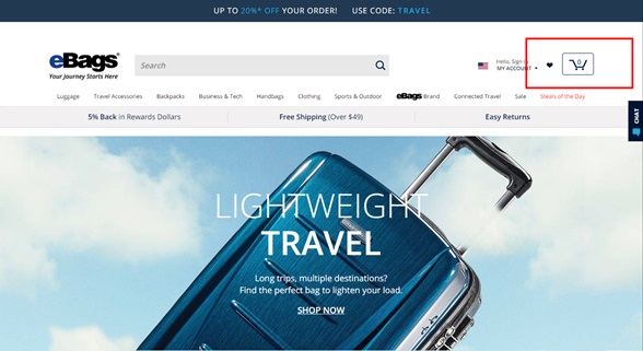
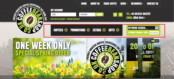
Shopping cart icons should be placed where visitors can locate them at first sight. That is, on the top right corner of a website. Specify the number of items that are added to the cart or whether no items have been added to the cart at all.
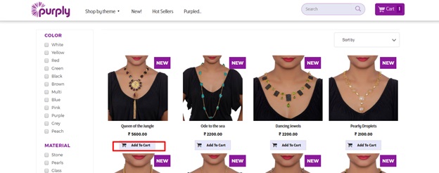
Apart from the home page, shopping cart buttons are also placed on the product catalog pages. These are directly placed under the each product information. It makes things easier for the customers who will then need to check out quickly before making the final purchase.
- Make Your Shopping Cart Obvious
This can be done by deciding on the obvious font and the size. The size of the shopping cart should be large so that they could be instantly visible at first glance. The choice of text too should be understandable and legible. In case of shopping cart buttons on the product catalogue page, choose words like ‘Add to Cart’ in order to give customers a clear instruction as to how to check out.
- Use Readable Table Based Layout
The information that you place in a shopping cart table should be free from any kind distraction. This also includes elements like complex styling.
The layout should be free from any kind of interruption. Therefore, when designing a shopping cart button, try avoiding use of complex backgrounds. Use only standard fonts. A product image on the shopping cart can help customers to confirm that they are purchasing the right product only. Provide only the necessary information that will help shoppers to complete their purchase process.
- Include the ‘Continue Shopping’ Link
The ‘continue shopping’ link will bring the shopper back the catalogue page instead of abandoning the website.
This is normally placed under the full shopping cart table where customers can easily find them.
- Stop Adding Too Many Fields
Too many fields in the checkout page can complicate things and result in shopping cart abandonment. Therefore try keeping the number fields to the minimum number. Including an appropriate number of white spaces can make your checkout page feel more organized.
- Show Preferred Payment Options
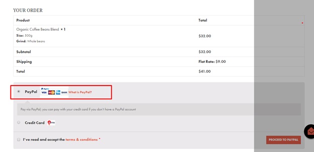
Customers will abandon a website if they do not find their preferred payment option during checkout.
It is therefore important that you include multiple payment options that will increase the chances for customers to continue their checkout process and reduce the chances of shopping cart abandonment.
Are You Designing Your Website’s Shopping Cart? – Conclusion
Then I hope these tips would help you in your shopping cart web design. In e-commerce it is the comfort factor that defines a web design as user friendly and helps to drive positive conversion. Do you need help in designing your website’s shopping cart?
Image Courtesy: pixabay.com

