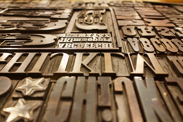
Designing a website for your business? Surely you need to do a good amount of brainstorming. And what are the most important things that you have to decide when you are planning to design a website? There are several things. These include the colors, the logo, and so on. And you’ll also need to focus on the fonts that you’re planning to use in the website.
So, what are the fonts that you are going to use while designing a website?
The fonts that are in vogue change almost every year. So, you’ll need to have a proper idea of the typography trends for 2016. This year, several typography trends must be followed properly if you want to give your site a proper look.
Here’s a quick sneak peek at how you should choose the right fonts and use them perfectly while designing your website in 2016 to get your message home in a prudent way.
Retro and Vintage
Retro is one of the most popular styles of all time. And people love vintage at times as well. There are quite a few areas where the retro and the vintage themes go perfectly well. This is being followed in case of the typography trends for 2016 as well. Both these forms of fonts are becoming increasingly popularly.
One of the major problems with these retro or vintage fonts is that they do not come in a package of freebies. Many of them are, in fact, paid fonts. And they aren’t easy to use either. Yet, it’s quite difficult for you to avoid these fonts. The reason: they are really cool and almost always in vogue.
Watercolor-based Fonts
Have you gone through some of the most popular websites that have been designed in recent times? Are there any special type of font, which are common to almost all of them? There must be a few. And among them, watercolor theme based fonts seem to be quite popular.
Want to know why?
These fonts offer a wide variation of colors. And they are soft as well. However, there are a few challenges that come with these features as well. For example, the colors seem to be quite feminine.
If you are planning to use the watercolors, you need to stretch your design skills a bit.
The watercolor designed fonts seem perfect when created with a brush script. But others function properly as well. No matter how they are created, the strokes should be thick to ensure that the colors are properly visible.
Using Fonts in Upper Case
How are you planning to use the fonts in your design? In what case are they being used? Have you ever planned to use the fonts in all caps?
What is the thing that comes to your mind when you think of using the fonts in the all caps mode?
It’s more suitable for shouting at someone through writing. But there’s some other use of such a use of fonts as well. Although some people are not too fond of using all caps in web design, they can still find a place there. There are quite a few popular fonts, which appear in all caps. And they are also used to scream something at the readers. In fact, they scream a message straight and clear. Besides, the navigation elements are displayed perfectly when they are designed in all caps.
Impact of Serif Fonts
Serifs and sans serifs have been around for quite long. But among them, the latter have been the more popular ones. They have found more use in website designing since long. But 2016 is likely to see a change in this trend. The serif fonts have been used in designing already, but not extensively. Moreover, they have not appeared excellent earlier when used in lower resolution screens. However, they are surely going to be the key to success for most of the web designers these days when high-resolutions screens are around.
Dramatization with Fonts
Why are you using the fonts in your web design?
To communicate. And that should not end with just simple messages. You should use your fonts in such a way that they are able to convey the feelings and the emotions as well. And this is done best through dramatic typography. While some of the sans serif fonts perform this task quite well, special fonts have more impact. The dramatization is meant to attract the attention of the readers in a perfect manner. The fonts should convey a message in as clear way as possible.
Fonts play an extremely important role in web design. But they must be used in the perfect way to ensure that the messages are communicated in a perfect manner. Following these few trends will help you get the message home without much hassle in 2016 and beyond.
Image Courtesy: pixabay.com


