The ongoing pandemic has largely increased the demand of e-learning. Globally scattered organizations have resorted to e-learning more than anything else for training their employees. The reasons are pretty simple.
It’s convenient, safe, easily accessible and at the same time, geographical barriers become irrelevant especially when training’s provided through e-learning channels.
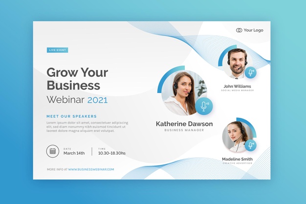
Webinars are considered a powerful medium to deliver content over the internet or through any other medium across various learning groups, be it large or small. These are easy to access, convenient and are tailor made for professional training purposes.
So how can you create the perfect presentation for your webinars? Here are some tips as recommended by our expert Greenville web designers that can help you out.
1. Create an appropriate blueprint
This is the first step. You should create a suitable blueprint that details the flow of your presentation. Your content should be based on this blueprint.
- Text should be crisp and right to the point
Your textual content must be right to the point. Do not wander off the topic. Think of it as a classroom presentation.
Try to use keywords in the best possible way. DO NOT stuff keywords though.
- Slide movement should occur at least after 20-40 seconds
You have to prepare your presentation on basis of a classroom presentation but you must also remember that unlike classrooms, no presenter’s here to talk and explain the matter to the students.
A virtual presentation must have a slide movement every twenty to forty seconds to keep the subject matter interesting to the audience. Your slides might include things like slide transitions, section highlights and annotations.
All these things must be relevant to the things that the learner wants to know.
- Use graphics wisely
Graphics are a significant part of virtual presentations. These graphics are the most attractive part of a content.
Use them liberally to provide appropriate context to the learners.
Graphics that need a little bit of explanation such as a graph or a chart needs to explained only to a specific point of detail. Do not put in too many details, otherwise the learner’s attention might flounder.
- Audio’s the back bone of virtual presentations
Clear and crisp audio’s considered the backbone of virtual presentations and are definitely instrumental in their success.
Go by a thumb rule. Go for minimum on-screen text and maximum background audio (explanations). You’ll definitely see the results in your favor.
And don’t forget that audio explanations should also be right to the point. Keep the limited time span of your webinar in mind. Your audio must not venture into unnecessary details.
- Your webinar presentation should be interactive
Provide interactivity in your webinar presentation through polls or questions. These things invite learner participations and is considered a positive feature of every presentation.
A poll can also be illuminating from your point of view. That’ll provide you with a good insight of the things that your audience actually knows.
Your webinar presentations can also ask open-ended questions to the learners. These questions can convince learners to delve deep into new ideas or concepts.
- Use collaboration tools for sharing purposes
You can use collaboration tools like whiteboards in webinars to share important documents and images. Explanation of such documents/images can be done though various annotation tools.
Important things to remember for designing an impactful webinar
- To deliver a strong and impactful webinar, you must remember that the timeframe’s limited. A webinar doesn’t allow a whole lot of time explain ideas and concepts in details.
- Various interactivities (such as videos, slide transitions, animations etc.) along with the speaker notes should be taken into account. Based on that, you should synchronize your audio piece accordingly.
- If you are talking to a global audience, you should try and minimize colloquial terms.
- Allow time slots in your webinar for questions and answers. This wouldn’t have been a problem if a human presenter conducted the entire matter. But then the term “webinar” would’ve lost its true meaning.
- Your webinar speaker will NOT be able to actually “see” the audience. Keep that in mind while designing your webinar presentations.
Take a peek at this short video where webinar is explained in details. This video itself is a webinar. The main thing that you should notice is that it’s only of 2 minutes.
But within 2 minutes, it delivers a host of information to the audience. That’s how your webinar should be. Short, crisp and right to the point!
Webinars are considered a powerful knowledge delivery tool. But it must be designed in the right way otherwise half of your audience won’t even get the underlying message.


