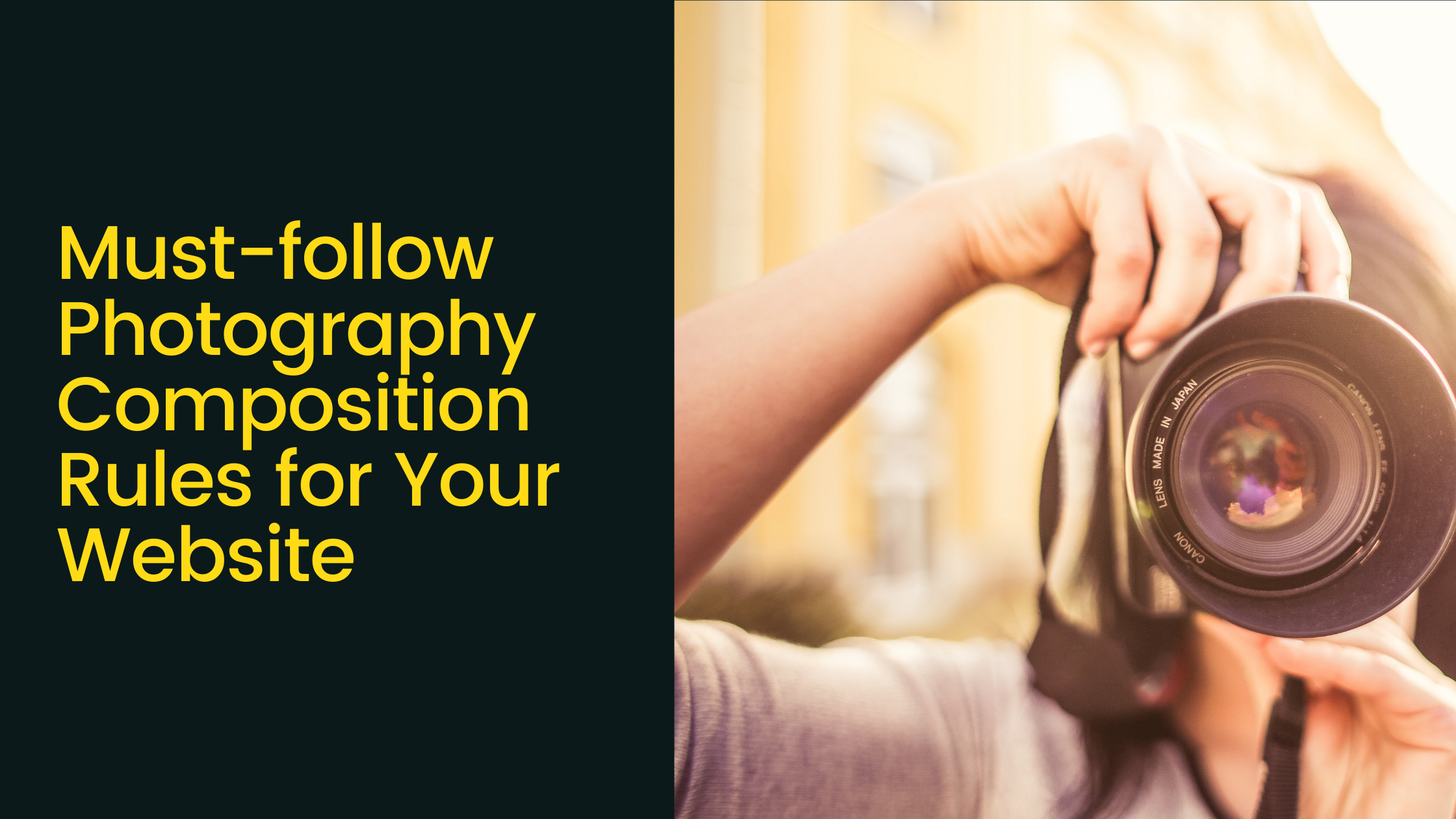
When it comes to having custom photographs on your website, the way you shoot is crucial. Poor photo composition can make even a fantastic subject look dull. Perfectly set scenes are capacitated to create a wonderful image from ordinary situations. To beautify images, we are required to follow a few rules.
As kids, we used to hate rules. We probably hate them even today. It stifles freedom as well as individual creativity. Photography is a way to express artistic freedom and creativity. So should there be any rule?
There is a simple answer to this question.
The photography rules are actually guidelines and not rules. They are there to guide you. You can break free if you need to without regret but make sure the aesthetics are maintained.
Let us have a look at some of the popular composition rules to improve custom photographs for your website. These tips are recommended by a professional web designer company in Colombia.

Fill the Frame
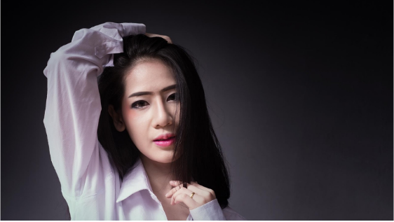
If you think that your shot is in the danger of losing impact owing to busy surroundings, crop around the chief point of focus. Eliminate background, so that all attention falls on the main subject. This works perfectly with portraits if you are trying to capture something more focused or shooting at a busy location where it is easy to get distracted. To fill the frame, you can capture people from the waist. You can also fill the frame just with their face.
Simplify Scene
When you look at a scene, your brain will quickly pick up subjects of interest. The camera cannot discriminate. It will capture everything in front. This often leads to a messy and a cluttered picture with no focal point.
- Choose your subject
- Select a camera viewpoint or focal length making it the center of attention.
You may not be able to eliminate other objects from the picture always. Try keeping them in the background; you can also make them a part of the story. Textures, patterns, and silhouettes work well in simple compositions.
Aspect Ratio

It is easy to remain stuck in a cult and take all the pictures holding the camera horizontally. Try to take the vertical shots adjusting your position or the zoom settings while experimenting with a new style. You can improve on both the vertical as well as horizontal shots by cropping the picture. It will be too much of a coincidence if all the real life subjects fit in the proportions of the camera sensor.
Avoid Cutting off Limbs
Keep an eye on the edges of the frame so that your subject does not have their body part chopped off. Cutting off the dog’s tail, cat’s ears or a part of the model’s head will not just spoil the shot, but unintentional chopping can divert the attention of the viewer too.
Strategically position the most significant elements of the photo

Divide your shot into several sections by a set of horizontal and vertical lines. With the imaginary lines in place, position the most significant element on one of the lines or where the lines meet. This technique works perfectly for landscape photography, since you can place the horizon on one of the horizontal lines and the vertical subjects like the trees on the vertical lines.
Include Frames
Frames have multiple uses when the composition comes under concern. They can:
- isolate subjects
- draw eyes directly to it
- hide the unwanted items behind
- give images a context
- aid context creation
Frames can be man-made like arches, fences, and bridges, or natural like tree trunks and branches. It can also be human.
Rule of Thirds
This is the king of all rules of composition.
Photographers who are used to taking more than just snapshots are aware of the rule of thirds. Human eye gets more interested in images which are divided into thirds, where the subject falls at or along one of the divisions.
Most DSLRs will offer a visual grid in the viewfinder. You can use this for practicing the rule.
Rule of Odds
This is somewhat related to the rule of thirds. The eye is much more comfortable with the images containing an odd number of elements as opposed to an even number.
The photograph of three birds is much more appealing than that of two birds. This is because the human eye prefers to wander towards the center of the group. If there is an empty space, the eyes will fall right there. You certainly want your viewers to look at the subject rather than an empty space.
It is hard to conclude a discussion on photographic rules. As already said, these rules should never stifle your imagination. They are just guidelines to enhance your creativity.