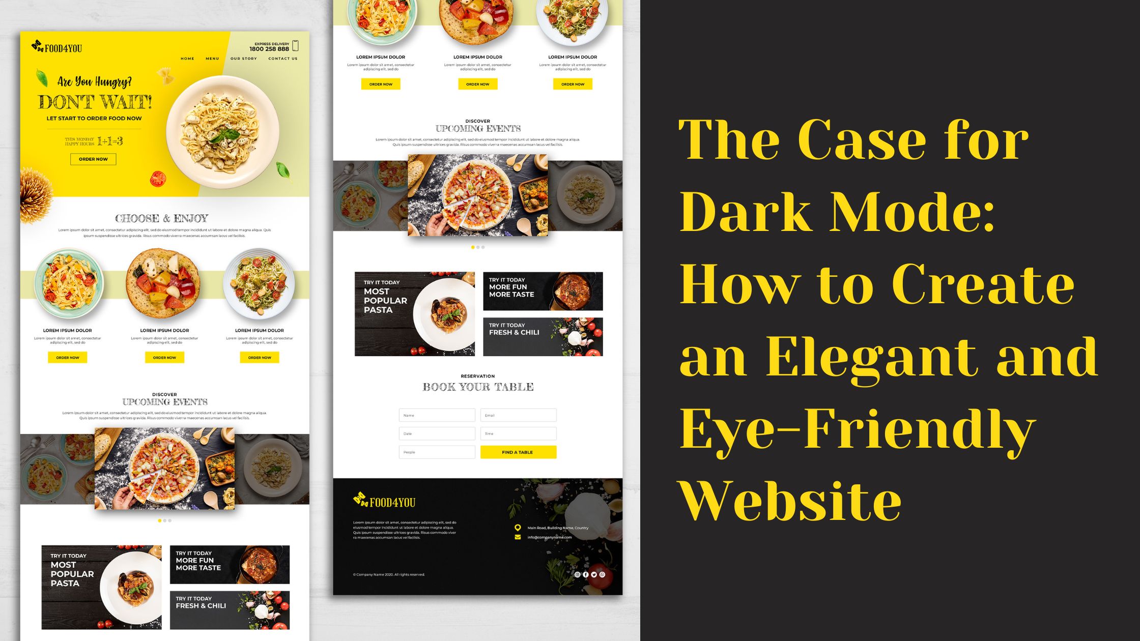
A website should be an elegant and eye-friendly place to spend time, but many times this isn’t the case. Why? Because websites are designed in white mode by default, which means that the background of your site will be white, as well as all of the text, links, etc.
With high-quality monitors becoming increasingly common among Internet users, this isn’t necessarily the best way to present your brand online. Here’s what a professional web design company suggests on the use of dark mode on your website.
Why Dark Mode Is Better
People of all ages are finding themselves sleeping later into the evening due to technology use. And blue light, which is produced by smartphones, tablets, and computer screens, is a major contributor. Blue light has been shown to decrease levels of melatonin in our bodies that can make it hard for us to fall asleep.
So what should you do? Install a dark mode! A dark mode changes your site’s background from white or black to a darker color.
This will filter out some of the dangerous blue lights emitted from devices. It may seem counterintuitive since many companies see black as being outdated or old fashioned but experts assure that is anything but the case when applied correctly in regards to websites.
When choosing a dark mode, choose a warm background color that isn’t too light. The colors should be both warm (darker) and cool (lighter) in color tones. These colors include red, yellow, orange, green, blue, purple or grey colors. Don’t use too many bright colors as they will be distracting.
A good idea is to make darker menu options slightly darker than lighter ones so it is easy to differentiate between them without being distracted by the content on your website while trying to read them.
Common Design Pitfalls
Dark mode can also have significant impacts on your design. For example, a dark background makes text difficult to read, and is a headache for those who use glare screens such as laptops in dark rooms. This means that too much of your website might be unusable for visitors using a laptop in low lighting conditions, which is common after sunset.
Another problem with dark mode is that it can make your site feel cold and clinical. Studies have shown that a light background with dark text inspires feelings of warmth, trust, and confidence in users.
Implementing Dark Mode on Your Site
Including dark mode on your website is all about aesthetics. However, dark mode can also help with legibility, which will make the site more comfortable to read in the first place. With all that in mind, here are six helpful tips to implement dark mode on your website.
- First, switch all your color schemes to dark or at least increase the contrast. In a browser like Chrome, you can accomplish this by going to settings, clicking display, and then changing the color toggle under general settings to black.
- Second, if using a CMS like WordPress or Squarespace, look into a plugin that makes this change for you or utilizes gray tones instead of black ones.
- Third, since light mode tends to be more legible on a white background, focus on changing your font color. A good first step is decreasing its brightness. If you’re working with a CMS that has a dark mode color scheme already (like WordPress does), use its dark theme instead of white.
- Fourth, consider using a font that’s not so bright. Cursive fonts are usually more legible in dark mode than serif fonts, which can sometimes be hard to read against light backgrounds. So if you want to maintain your brand identity and use a serif font, try an offshoot like Georgia. If you want something cursive but more legible, try Calluna Sans or Lato.
- Fifth, don’t forget about secondary information on your site—like sidebars and headers—since these areas need color contrast too. A trick for increasing contrast is making that content smaller or making darker shadows underneath them so they don’t blend in with their background.
- Sixth, make sure your navigation is visible against a dark background. It’s easy to forget about navigation, but it’s one of those crucial parts of your site that’s always visible.
Dark vs light – what to use on your website?
As with so many things in life, there are arguments for both sides. Light mode is better when looking at a screen before bed as it will affect your sleep patterns. Bright light can stimulate the brain which may interrupt sleep patterns. Dark mode will be less likely to have this effect.
To keep things in balance, it is suggested to keep both the modes on your website and give the choice of use to your users. A simple toggle button at the top menu can make it easy for your users to switch from dark to white and vice versa whenever they want.