What comes to your mind when you hear the word ‘Web Design’?
Colors? Images? Illustrations?
Yes, these are integral parts of a perfect web design. But these are not everything. There’s something else that’s equally important. The fonts. They are part of the content that you need to create a successful website. But they are equally important when it comes to web design as well. While creating a website, you need to select the right fonts and place them in ways that make the site look attractive.
But is there any set pattern of using fonts in web design?
Actually not. The typography trends are usually dynamic and they continue changing with time. However, you have to use the fonts prudently to ensure that they help you reach out to your target audience.
Here’s a quick look at some of the typography hacks that you must perform while designing your website:
Select Larger Fonts to Attract the Attention
Among the most prominent typography trends in the coming years, the size of the fonts is surely going to play an extremely important role.
Earlier, you would mostly see websites using fonts that are average in size. However, this trend is changing. Most of the sites these days are embracing large fonts. In fact, the fonts that are being used are mostly larger than the average size.
Is there a reason behind this?
Of course, there is. The large fonts are usually more effective in attracting the attention of the audience. They also deliver a bold statement about the design.
The use of large fonts is expected to increase in near future as well with the objective of conveying the message of the website to the audience in the most effective manner.
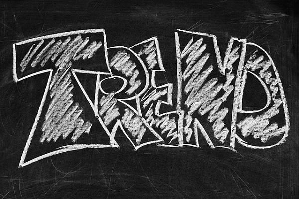
Focus on Hand-drawn Typefaces
Do you think the hand-drawn typefaces look great?
Not everywhere. But they are becoming increasingly popular with every passing day. The hand-drawn typefaces give a natural touch to the design. Besides, it also brings the site a lot closer to the audience with a personal approach. Moreover, these fonts can look amazing if you’re using them in the right color.
Mix and Match Fonts that Partner Well
Have you ever thought of mixing different types of fonts while designing your website?
Probably not. Because using different typefaces wasn’t the trend even a few years ago. However, the trends change. You should now blend various types of fonts. However, it is always important to research and find fonts that partner one another, rather than choosing the ones that appear as complete strangers to one another. It will help you create an attractive visual by using fonts that play on one another. So, the fonts are going to play an important part in creating the effect that is likely to impact the viewers when they come across the website for the first time.
Reach Out to People with Various Personalities
Have you ever delved into the personality aspect of the fonts you’re using for your website?
Studies have shown that fonts too have personalities. That is, different types of fonts attract people with various personalities. For example, simple fonts, such as Times New Roman or Arial, attract people who have stable personalities. However, people with more creative bent of mind are attracted towards designer fonts. Fonts, such as Kristen, Gigi, and others tend to please them more.
So, you must take into account the personality of your target audience while selecting the fonts for your website.
Use Bright Geometric Fonts
Geometry always has an extremely important role to play in web design. It is equally important in typography as well.
What are geometric fonts?
These refer to fonts that are created keeping in mind some geometric shape. So, when you’re using a geometric font, the alphabet A is likely to appear more as a triangle. The geometric fonts can be divided into the following categories:
- Square typefaces
- Triangle typefaces
- Circle typefaces
- Oval typefaces
All the alphabets can be categorized under these typefaces and they are designed in the respective geometric forms. The use of these types of fonts is increasing with every passing day. These fonts are expected to attract the website visitors. You should also use these fonts in bright colors to ensure that they look great.
Conclusion
Fonts occupy a major position in the field of web design. So, when you’re designing a website, you must give equal focus on visuals as well as fonts. In fact, selecting the right fonts can help you create exciting visuals as well. So, you must follow the typography trends for 2017 to select the right fonts for your design and use it in the best possible manner to communicate better with the audience.
Image Courtesy: Pixabay.com


