A Call-to-Action button is one of the essential components of marketing, sales and based promotional actions of an e-commerce website.
However, designing a good CTA button is the tricky part of website creation that can skyrocket your online sales or bring a website conversion crashing down. To create an effective CTA button, you would need first to understand the essential characteristics that make a CTA button. You can learn from a thousand number of contents that are written to guide beginners and designers on how to tweak a website button.
Or, you can learn from the practical experience of how other sites create Call-to-Action button to prompt action from their target audience. Here’s a look at the list of a few websites and how they use the CTA button as a trigger action to generate the maximum number of sales –
1 – Evernote
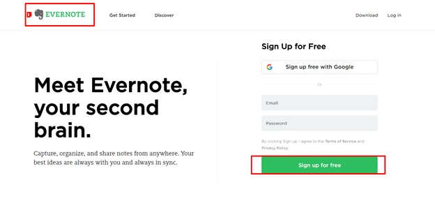
If your website has a simple design, then Evernote could be the best example for you. Evernote utilizes its brand logo color for the CTA buttons.
Note how the green color that is used for the primary and the secondary button is the same as the one used for the logo. Also, note how simple the copy is for the CTA buttons – ‘Sign Up.’ The message is loud and clear here. Evernote wants its customers to subscribe to their page. And the reason why should they sign up is explained on the page, above the CTA button – ‘Remember Everything.’
Important Points to be noted
- Make the action loud and clear. You do not have to explain the reason why you want people to sign up on the CTA button. You can do this outside the CTA button just like Evernote has done it.
- If you don’t have a clue as to what color should go with your CTA button, then refer to the logo color of your brand.
- It’s okay to use the same color for your primary and secondary CTA button.
2 – Dropbox
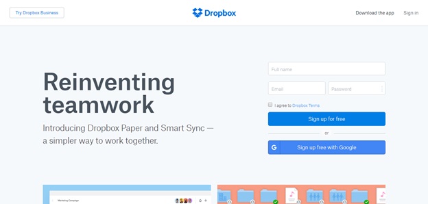
Dropbox website sports a simplistic design and has a lot of negative spaces. The subtle nature of the web design style has allowed the CTA button to stand out from the other elements. Just like Evernote, Dropbox also uses its logo color for its CTA button. Application of the logo color on the CTA button makes it easy for customers to interpret that they need to click on the button to sign up for Dropbox.
Important Points to be noted
- Using the logo color on the CTA button helps to create a connecting link between the brand and the customer response.
3 – Unbounce
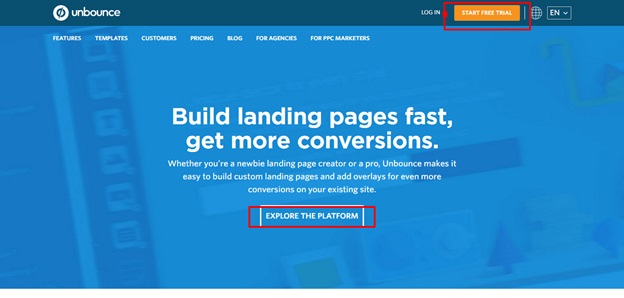
The website addresses two main concerns that every customer will have when visiting the page –
- The motivation for clicking on the CTA button
- The prospect that a customer will get after clicking on the CTA button
Quite naturally, Unbounce tries to address these concerns by adding a unique and concise CTA message – ‘Explore the Unbounce Platform’. The message gives out a clear promise of rewarding the target customers with information on products and its features.
Important Points to be noted
- A CTA button should be addressing the concerns of prospective customers
- A CTA button should also have a clear and concise CTA message that promise to return higher rewards
4 – Usabilla
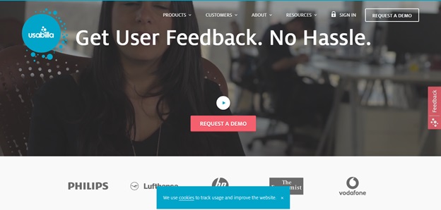
Website Call-to-Action does not have to be witty or super smart always. Too much persuasion can spoil the marketing strategy. Besides, it is a bit annoying anyway. Instead of using strong language, Usabilla tries to go the subtle way around. That is, by willing to perform the desired action such as ‘Request a Demo.’ The website has kept their message consistent and clear throughout.
Important Points to be noted
- Persuasive message language does not always work. In particular cases, CTA messages should take a subtle approach to persuade their customers to take the desired response action.
- Messages of CTA buttons should be kept clear and consistent throughout
5 – HotJar
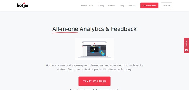
The word ‘Free’ is always a matter of excitement. If you have a reason to persuade your prospects just like HotJar here, then it’s best to spread the word everywhere on your Call-to-Action.
However, offering something free also comes accompanied with the biggest hurdles of uncertainty and risk. You can, however, mitigate that with the help of a soothing copy that will assure your prospects that it won’t cost them anything.
Important Points to be noted
- Why not emphasize on the word ‘free’ if you have something to offer to your prospects?
- Give assurance to your prospects to gain a sense of understanding and trust
6 – Netflix
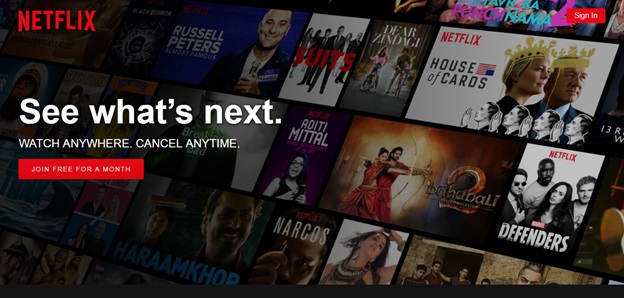
One of the biggest fears that many have is getting committed to sign up for something. It could turn out to be annoying and harm the brand’s image in case if the user does not like the service in the end. In that case, like Netflix you need to nip that fear from the bud immediately, using a simple but clever copy that says – ‘Cancel Anytime.’
Netflix has placed this message just above the CTA button that asks people to subscribe free for a month. The reassurance alone has boosted up the number of increased sign ups. You will also notice that the website uses its brand color red to match the color of both the primary and the secondary CTAs.
Important Points to be noted
- Accompany your CTA promise with a little bit of reassurance. It works wonders.
7 – QuickSprout
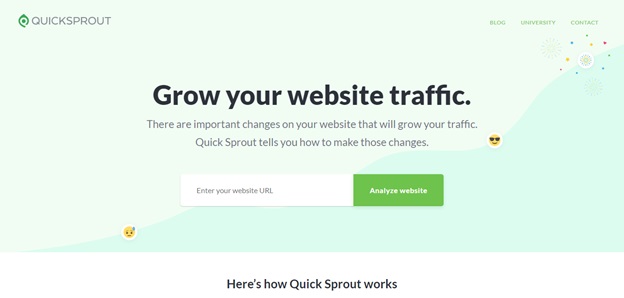
Who does not want to be a perfectionist when it comes to being part of the digital trend? QuickSprout highlights the weakness, making their CTA message click worthy. It uses a tone that entices the visitor to want to click on the CTA button and see it through.
Placing the CTA button midway down the page is a great tactic for catching the reader midway instead of having to wait for the customer to finish the entire blog before taking the desired call to action. That’s because according to a research, readers do not complete reading a blog post and placing a CTA button at the bottom of the blog post would be an utter waste of time and energy.
Imported Points to be noted
- Convey your message loud and clear. What is it that you want your target audience to do?
- Proper placement of the CTA button is important for grabbing the reader’s attention
Conclusion
So, there you have it – a list of some of the websites that show how the Call-to-Action is utilized on their web page. The Call-to-Action is an essential element of a web design. Investing some time and effort on crafting a good CTA design, keeping the page context in mind can help you to generate generates.
I hope you have followed how the different websites make use of the CTA button. If you are looking for a professional CTA designer, then feel free to get in touch with us soon.
Image Courtesy: www.business2community.com