What do you do when you find an interesting app? Sure you cannot judge the app by its design cover. But you can definitely judge it by its user experience. That’s why onboarding is so important. But first, what is onboarding anyway?
Onboarding Mobile App Users to a Delightful Digital Experience
When deciding the design of a mobile app, mobile app developers need to make sure that the user interface design does not complicate things for a first time user. This is where mobile app onboarding comes in.
Onboarding is a strategy to help users successfully adapt a product and fully embrace it. Meaning, it explains users how to interact with the app and even point out the features available in the app.
Onboarding follows the 80/20 rule, where developers need to spend 20 percent of the time is invested to demonstrate users about the app’s features and functions so that users can spend 80 percent of their time using it. This will indirectly ensure 80 percent return of the profit.
Unlike existing mobile app users, new users are not to be expected to be accustomed to a mobile app’s design interfact. If they find it difficult to use, they will simply abandon the app. Onboarding is done to simply avoid this and to keep the communication flowing between the mobile app and its users.
Would You Like to See a Visual Example?
Then here is an example of how Beats Music app onboarding does to engage customers and to personalize their music listening experience.
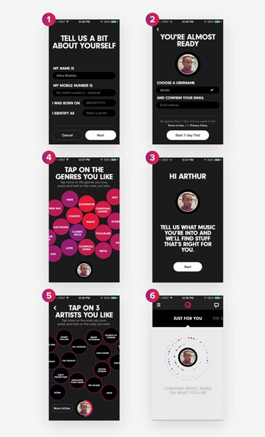
The app gives a great onboarding design experience that appeals to the users’ music taste and allows users to enjoy a unique experience. In addition, if you haven’t noticed, the message ‘Just for You’ is a great way to shout out loud the hidden message – ‘customized’.
Using onboarding strategy, Beats Music app tries to cater to the various tastes of different users while providing them a user experience, different for everybody.
There are Three Techniques to Onboard Designs for Mobile Apps
These are –
- Benefits-oriented onboarding
- Function-oriented onboarding
- Progressive onboarding
Each of these different onboarding designs have different guidelines and techniques to follow. Let’s take a close look into each of them.
Types of Onboarding Techniques
#1 – Benefits-Oriented Onboarding
The benefits-oriented onboarding technique is pretty much self-explanatory. Designing a mobile app’s onboaring flow with this technique helps to communicate more than one of the following things –
First – What does the app do?
Second – How will it help users in their daily life?
Third –What kind of value will the integration provide?
There are certain principles that you would have to consider when implementing the benefits-oriented onboarding technique. These are –
- Highlight a Maximum of Three Benefits
Considering the size of the mobile screen and the need to give a quick overview as to what the app is all about, it’s important that you consider the number when you are using visual displays to talk about the benefits.
You should maintain a minimum of three benefits. Users will learn about the app without getting bored. In addition, the use of minimum information will not slow down your mobile app performance speed.
- Use the ‘One Slide, One Concept’ Rule
Applying the ‘one slide, one concept’ rule for onboarding will help you to focus on the important message only. Users will be able to focus only on the important ones that are easy to digest. Overcrowding the design with too many information can be distracting and noisy.
- Prioritize User Needs
Resist the urge to show off. Instead, analyze the user data to understand what kind of problems users are facing and what your app can do to solve it.
- Be Consistent in Your Vocabulary
This will keep the approach efficient, effective and succinct. A coherent and harmonious presentation in both visuals and terminology can kick off the user’s experience on a positive note.
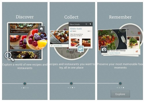
The Evernote Food app uses verbs to quickly communicate the benefits and grab the attention of users. But, if you cannot boil down things to verbs and adjectives then using few good phrases will do good. Just make sure that you stick with it all the way in your communication.
- Time for Onboarding
Since onboarding is meant to give just an overview, its better to present it before the user signs up for the mobile service.
Once they are logged in, it’s time to let them explore the app. Users will no longer be distracted by reminders or benefits of the app.
#2 – Function-Oriented Onboarding
This is another onboarding technique where you forgo giving an overview of your app’s benefits and instead focus on the key functionality.
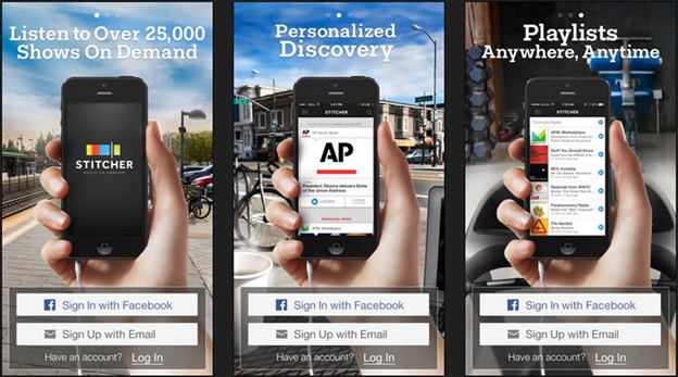
In this technique, you will need to –
First – What are the key functionalities ( that is – how to get the app started?/ what are the most common actions?)
Second – How to use the functionalities ( via tapping or swiping)
Third – When to use the functionalities (that is – when viewing the search results)
There are certain principles that you need to keep in mind when applying the function-oriented onboarding –
- Avoid explaining the Obvious
For example do not go on explaining ‘X’. Since the dawn of the internet, the ‘X’ has always represented things like exiting, closing or cancelling. Users would be knowing this already. Hence including this in your onboarding explanation will not add any value.
- Present Three Slides
Just like Benefits-oriented onboarding technique, keep your slide presentation to three slides only. Make sure that you present one function for one slide only.
- Prevent Empty by Default
Your onboarding strategy should also focus on how to solve problems like an empty app by default. This will not look good if they enter an app for the first time only to find it blank.
Include a quick note even if it’s for a fraction of a second. This will stop them from wondering as to whether the blank screen is a feature or a bug.
- Time for Onboarding
Just like Benefits-oriented onboarding, keep your feature-oriented onboarding technique before users log in or sign up for your service.
#3 – Progressive Onboarding
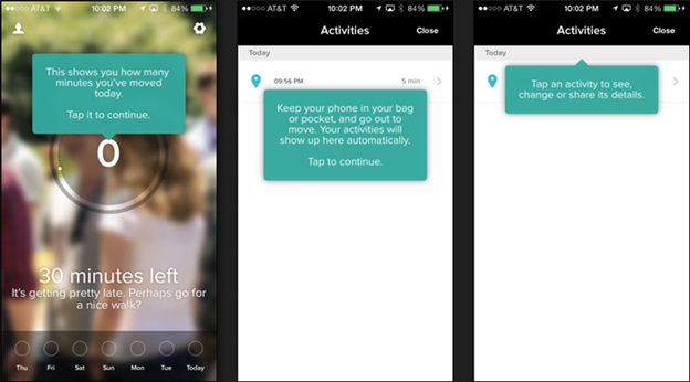
The progressive onboarding technique relies on the fact that users can learn through practical exposure. Take a look at this example below.
In the first screen, the user is instructed to take a photo. A visual text showing related instruction comes out pointing towards the icon indicating the phone’s camera.
The technique follows the same pattern in the next two screens.
A few things to keep in mind when using the progressive onboarding technique –
- Use it for Complex Workflows
If your app has a complex workflow to handle, then a progressive onboarding is the right choice. Using the progressive onboarding technique, you can feed users with appropriate information when it is logical to feed in the workflow. This will give users time to digest.
- Apply it for Hidden Functionality
When designing a mobile app, it is essential to make efficient use of the small screen and to keep away any kind of distractions. This also requires hiding the menu and the function, which can only be visible via double tap. During overboarding, you will need to walk the users through the hidden functions.
- Drive Communication with Gestures
Gesture driven communication are used in certain mobile apps. Using gestures, users are instructed to take action over time as the functionality is introduced with the help of information stick.
Some Examples of App Onboarding Done Right
Mailbox uses a combination of several screens to direct and to guide users regarding the functionality of the app. The onboarding flow here showcases the features of the app and how users can use them.
YouTube Capture makes use of inline hints to direct users in a simplified manner regarding how they can use the app. This is explained using directly-intended text.
Spring takes a flowchart approach explain the app’s features and how users can make good use of it.
Final Words
Onboarding design is important for building a mobile app’s seamless user experience. To design a user-friendly onboarding experience is definitely no rocket science. But will require some good guidelines to get started. Hope this article has provided some good guidelines to help you jumpstart a good onboarding design.
Image Courtesy: Pixabay.com

